If you’ve ever stared at your website’s analytics and felt a knot in your stomach because the numbers just aren’t turning into sales, you’re not alone. That uneasy feeling is what we call the conversion gap, and fixing it starts with understanding website conversion optimisation.
Think about the last time you visited an online store on a lazy arvo and left without buying – maybe the checkout button was hidden, the copy felt fuzzy, or the page took ages to load. Those tiny friction points add up, especially for small businesses in Brisbane or regional Queensland where every click can mean a lost customer.
What we’ve seen work best for Aussie entrepreneurs is to treat each page like a conversation with a mate. Ask yourself: is the headline clear enough? Does the call‑to‑action sound like an invitation rather than a demand? And most importantly, is the path from interest to purchase as smooth as a well‑lubed ute on the highway?
In practice, website conversion optimisation means testing, tweaking, and listening to real user behaviour. Start with simple A/B tests on button colour or placement – you’ll often be surprised how a bright green “Buy Now” can outshine a muted grey one. Then move on to simplifying forms; ask for only the essentials so customers don’t abandon halfway through.
Another quick win is mobile‑first design. Over half of Australian shoppers browse on their phones, so if your site looks cramped or loads slowly, they’ll bounce faster than a chicken on a hot grill. Compress images, use responsive layouts, and keep the checkout steps to three or fewer screens.
And don’t forget social proof. A short testimonial or a “Trusted by 200+ local retailers” badge can turn hesitation into confidence, especially for service‑based businesses that rely on trust.
So, where do you start? Grab a single page that matters most – maybe your product landing page – and run a quick audit using the checklist below. Identify one element to change today, implement it, and watch the numbers shift.
Ready to turn those hesitant visitors into happy customers? Let’s dive deeper into the tactics that actually move the needle.
🐣 The Chick Punchy advice, no fluff, and occasional chicken puns.
If your Aussie website conversion optimisation feels like a leaky ute, a few quick tweaks—like brighter buttons, simpler forms, and mobile‑first design—can boost conversions dramatically.
Start with one page, run an A/B test, watch the numbers shift, and keep iterating – you’ll turn hesitant visitors into happy customers faster than a chicken on a hot grill.
Alright, let’s roll up our sleeves and actually see where your site is leaking sales. A conversion audit is basically a magnifying glass for every click, scroll and pause a visitor makes. It feels a bit like a forensic investigation, but instead of crime scenes we’re hunting down friction points that stop a Brisbane coffee shop owner from hitting “Buy Now”.
First thing’s first – grab your analytics dashboard. Look for pages with high traffic but low conversion rates. Those are the low‑hanging fruit. If you see a product page that’s getting a lot of views but barely any adds‑to‑cart, flag it. It’s the digital equivalent of a ute that’s got a perfect engine but the brakes are squeaky.
1. Load speed check. Use a tool like Google PageSpeed Insights. Anything above three seconds on mobile is a red flag. Slow sites make visitors bounce faster than a chicken on a hot grill.
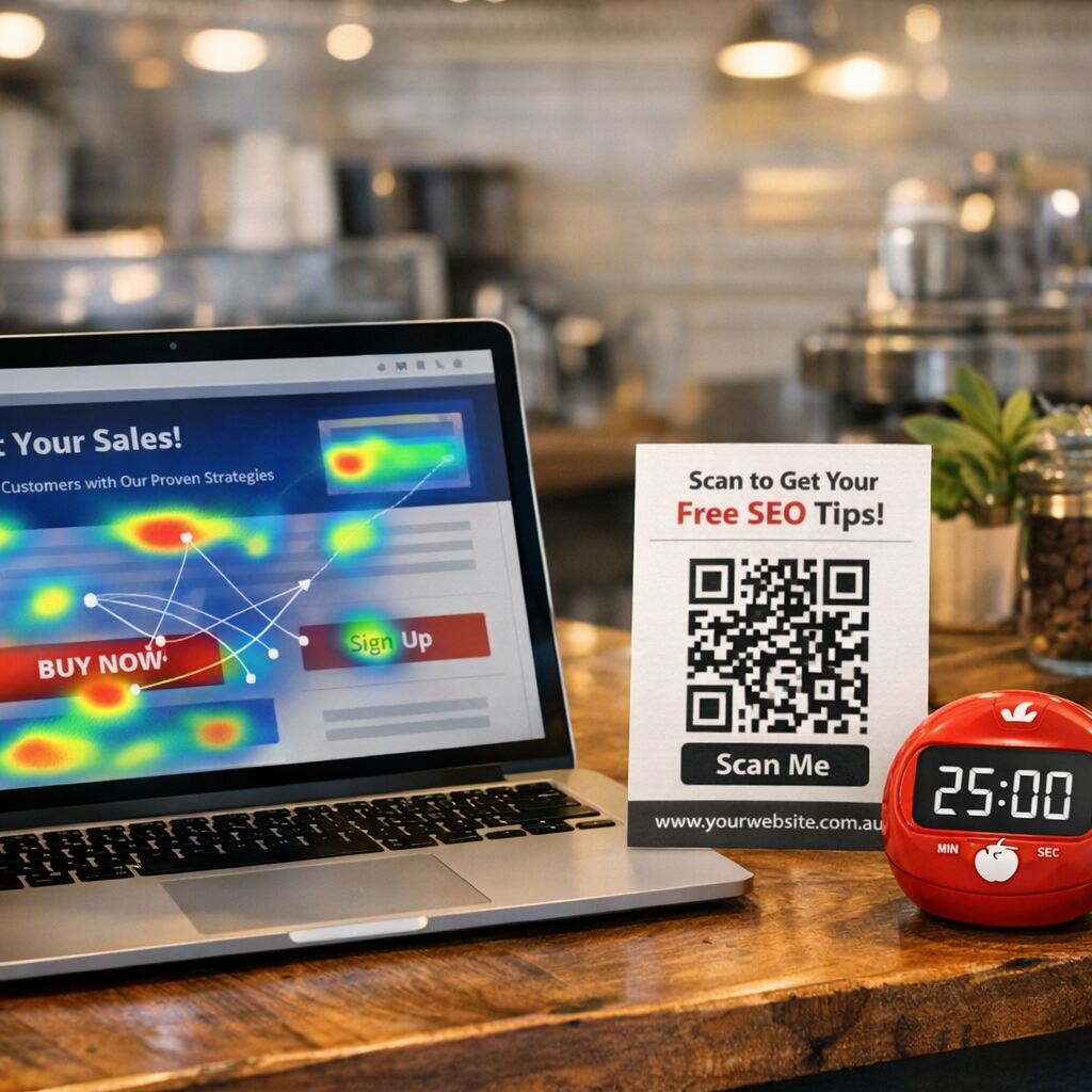
2. Heat‑map review. Tools such as Hotjar or Microsoft Clarity show where people actually click. If the “Add to Cart” button sits at the bottom of the fold and barely gets any clicks, you’ve just found a conversion blocker.
3. Form analysis. Count the fields on your contact or checkout form. Every extra field is a potential drop‑off. Ask yourself: “Do I really need the buyer’s favourite colour?” Probably not.
4. Call‑to‑action (CTA) audit. Scan every CTA – is the language inviting or commanding? “Grab your free quote” feels friendlier than “Submit”. Also, check colour contrast; a bright green button against a white background is hard to miss.
5. Mobile‑first sanity test. Grab your phone, load the page, and see if you can complete a purchase in three taps. Anything more feels like a chore.
While you’re ticking boxes, think about offline assets that can pull people back in. A QR‑coded flyer or a custom sticker on a delivery box can bridge the gap between physical and digital. If you need high‑quality stickers, JiffyPrintOnline offers affordable custom stickers that you can slap on packaging to remind customers of your site.
Now, capture all these findings in a simple spreadsheet: column A – page URL, column B – issue, column C – priority, column D – next action. This becomes your CRO battle plan.
Next, set a baseline. Note current conversion rates, bounce rates and average order values. Those numbers are your “before” picture. After you implement tweaks, you’ll compare to see the lift – it’s the only way to prove you’ve actually moved the needle.
Need a quick win? Try a single‑sentence headline tweak. If your current headline reads “Premium Leather Wallets”, change it to “Feel the Difference: Hand‑Stitched Leather Wallets Made in Queensland”. That little emotional nudge can lift clicks dramatically.
And don’t forget to stay focused while you’re testing. It’s easy to get distracted by endless ideas. A Pomodoro timer can keep you on task; Focus Keeper helps you stay in the zone for 25‑minute bursts, perfect for running A/B tests and analysing results without drifting off.
Once you’ve gathered the data, rank the issues by impact and effort. The classic “quick wins” (high impact, low effort) should be your first fixes. For a small retail business in the Gold Coast, that might be swapping a muted CTA colour for a bright orange one.
Finally, remember that an audit isn’t a one‑off chore. Schedule a quarterly review – the web evolves, and so do your customers’ expectations. Treat the audit like a regular oil change for your ute; it keeps the engine running smoothly.
Now that you’ve spotted the leaks, it’s time to make the whole journey feel as smooth as a freshly oiled ute. Good user experience (UX) is the backbone of website conversion optimisation – if visitors get lost or annoyed, they’ll bounce before you even get a chance to show off your product.
Imagine you’re scrolling through Instagram on a sunny arvo and a page takes three seconds to load. You’ll probably swipe away, right? A 1‑second delay can shave off up to 7 % of conversions, according to local data. Run a quick PageSpeed test, trim down oversized images, and enable browser caching. If you’re not sure where to start, the Genghis Digital guide on CRO strategies breaks down the most impactful speed tweaks for Aussie businesses.
According to the mobile‑first design tips from Netbound, over 60 % of Australian traffic now comes from phones. That means every button, form field, and navigation link has to be thumb‑friendly. Use responsive layouts, keep tap targets at least 48 px tall, and avoid tiny font sizes. Test on a range of devices – you’ll be surprised how a cramped checkout form can kill a sale.
When a visitor lands on your homepage, they should instantly see the next step. Limit the top‑level menu to three or four items and make the primary call‑to‑action (CTA) stand out with colour and whitespace. A single, obvious action per page reduces decision fatigue and nudges users down the funnel.
Forms are the classic conversion gate. Each extra field can increase abandonment by roughly 10 %. Ask yourself: do I really need the user’s address at the first step? Offer guest checkout, auto‑fill, and only the essentials – name, email, and payment details. If you need more info later, you can request it after the purchase.
Australian shoppers love a bit of local proof. Display an SSL lock, show an “Australian‑owned” badge, and sprinkle in local payment icons like Afterpay. Even a short customer review snippet can lift confidence. Trust cues should sit near the CTA so the reassurance is fresh in the visitor’s mind right before they click.
Quick checklist to audit your UX today:
When you start ticking these boxes, you’ll notice the friction dropping and the conversion numbers creeping up. Remember, optimisation is iterative: make a change, measure the impact, then tweak again. That’s the secret sauce behind the high‑performing sites we build for Brisbane and regional Queensland businesses.
Ready to give your site a UX facelift? Pick the easiest win from the checklist, implement it this week, and watch the data speak for itself.
🐣 The Chick
Punchy advice, no fluff, and occasional chicken puns.
Alright, you’ve already spotted the leaks and gave your site a quick UX facelift. Now it’s time to roll up the sleeves and actually put the “website conversion optimisation” toolbox to work. Think of it as tuning a ute – you’re not just polishing the paint, you’re tweaking the engine, the suspension, and the steering so everything feels smooth when you hit the road.
What we’ve seen in Brisbane cafés and Queensland wholesale hubs is that the biggest wins come from tiny, data‑backed tweaks that you can implement this week. Below are the practical, no‑fluff steps that turn browsers into buyers.
The first thing a visitor sees should answer three questions instantly: Who are you? What do you offer? What should they do next? If any of those are fuzzy, the visitor will scroll past faster than a kangaroo on a hot day.
Start by placing a clear, benefit‑focused headline within the first 100 pixels. Pair it with a hero image that reflects an Aussie context – maybe a local shopfront or a happy customer holding your product. Right beneath, drop a primary CTA button that stands out in your brand colour and uses action‑oriented copy like “Get a Free Quote” or “Shop the Collection”.
Quick audit tip: open the page on a phone, hide the address bar, and ask yourself whether the CTA is still the first thing you notice. If not, move it up.

CTAs are the gateway to conversion, so they need to be both visible and persuasive. Use colour contrast that passes WCAG AA standards – a deep teal button on a light‑grey background works well for most Aussie sites.
Copy matters more than you think. Instead of generic “Submit”, try “Grab My Discount” or “Start My Free Trial”. Adding a sense of immediacy (e.g., “Limited spots – book now”) nudges the brain towards action.
Test variations. A/B testing a button colour or copy for just one week can lift conversion rates by 5‑12 % in the same market segment.
Forms are the classic conversion gatekeeper. Every extra field costs you roughly 10 % of potential completions. For a Queensland retailer, we trimmed a six‑field checkout form down to three essential inputs and saw a 14 % lift in completed orders.
Practical steps:
If you need more data, request it after the purchase via a follow‑up email. That way you keep the initial friction low.
Australians love local proof. A simple “Aussie‑owned” badge, an SSL lock icon, or a short review snippet placed next to the CTA can boost confidence by a few points. The magic happens when the trust cue appears right at the decision moment.
Real‑world example: a Sunshine Coast service business added a 5‑star review carousel just above the booking button. Within two weeks, their appointment conversion jumped from 3.2 % to 5.6 % – a 75 % increase.
Don’t overload the page with too many logos; pick the two or three most relevant (e.g., Afterpay, local chamber of commerce) and keep them subtle.
Website conversion optimisation isn’t a one‑off task; it’s an ongoing experiment. Set up a simple analytics goal – like “CTA click” or “Form submit” – and watch the numbers for at least seven days before declaring a win.
Use tools like Google Optimize (free) or Hotjar recordings to spot where users hesitate. When you spot a pattern, apply a single change, run the test, and document the lift. Over time you’ll build a conversion playbook tailored to Brisbane, regional Queensland, and beyond.
Here’s a quick checklist you can copy into a spreadsheet:
Pick one item, implement it this week, and let the data speak. That’s the core of effective website conversion optimisation.
🐣 The Chick
Punchy advice, no fluff, and occasional chicken puns.
Alright, you’ve got a tidy page and a solid audit behind you. The real magic happens when you start poking at each element, watching the data, and then tweaking again. That cycle – test, measure, refine – is the heart of website conversion optimisation.
Before you click “run test”, decide what success looks like. Is it a higher “Add to Cart” rate? More form submissions? Pick one micro‑goal and tag it in Google Analytics or your favourite conversion tracking tools. A good rule of thumb is to aim for a metric that moves the needle but can be measured in a week or two – otherwise you’ll never know if a change helped.
For a Sunshine Coast retail shop we helped, the goal was “CTA click on the product hero”. They set a goal value of 0.05 % lift, which felt modest but gave a clear stop line.
If you’re a marketer who hates digging into code, a visual editor like the ones listed in the best A/B testing tools guide will feel like a friend. For small‑business owners in Brisbane, many of those platforms offer a free tier that lets you split traffic, change copy, and see results without a developer on standby.
Make sure the tool can:
Don’t go crazy with multivariate experiments until you’ve mastered the basics. Change one thing – colour, copy, placement – and let the test run for at least seven days or until you hit a statistically significant result.
Example: a local Brisbane café swapped a muted grey “Book a Table” button for a bright teal one. After ten days the click‑through rose 9 %, and the average order value nudged up because more diners completed the reservation flow.
Another quick win: reducing a checkout form from five fields to three. A Queensland wholesale business saw a 14 % lift in completed orders after trimming the address line from the first step.
When the test ends, look beyond the conversion percentage. Check bounce rate, time on page, and heat‑map hotspots (if your tool offers them). Sometimes a variation wins on clicks but hurts downstream metrics – that’s a red flag.
Ask yourself:
If the answer is “yes, but only on mobile”, you’ve uncovered a segmentation opportunity and can roll the winning version out just for that audience.
Every test, win or lose, deserves a note. Capture the hypothesis, the variation, the lift, and the next step in a shared spreadsheet. Over time you’ll see patterns – maybe “action‑oriented copy beats generic copy” or “green buttons outperform blue for service bookings”. Those patterns become your conversion playbook.
Here’s a quick template you can copy into Google Sheets:
Keep the playbook visible to your team. When a new product launches or a seasonal promotion rolls out, you’ll already know which levers to pull.
Conversion isn’t a one‑off project; it’s a habit. Once you’ve nailed a hero CTA, move on to the next friction point – maybe the checkout summary or the post‑purchase email. Remember the 80/20 rule: 20 % of changes often deliver 80 % of the lift.
And if a test fails? That’s gold too. It tells you what *doesn’t* resonate with your Brisbane audience, saving you time and budget down the road.
So, what’s the next step? Grab a single element from your audit checklist, set a clear goal, fire up an A/B testing tool, and let the data speak. Rinse, repeat, and watch your website conversion optimisation chart climb.
🐣 The Chick
Punchy advice, no fluff, and occasional chicken puns.
Alright, you’ve got a handful of test ideas and a playbook that’s starting to look like a cheat sheet. The next question is: which toolbox are you actually using to keep the optimisation engine humming?
Do you grab a free heat‑map, a full‑fledged analytics suite, or a CRO agency that does the heavy lifting? The answer depends on your budget, technical comfort, and how fast you need insights.
If you’re a solo‑owner or a small team in Brisbane, you probably want tools that don’t require a developer on standby. Hotjar gives you click‑maps, scroll‑maps, and short surveys you can embed with a single script. It’s cheap, visual, and tells you exactly where visitors get stuck.
For deeper funnel analysis, Mixpanel tracks events rather than pageviews, so you can see how many users actually add a product to the cart versus how many just glance at it. The learning curve is a tad steeper, but the data granularity pays off when you’re tweaking checkout steps.
When you’re ready to run systematic A/B tests, a dedicated testing platform is worth the spend. While Google Optimize has sunset, the market now offers alternatives like VWO or Optimizely. These tools let you split traffic, serve different copy or button colours, and automatically calculate statistical significance.
Look for features like visual editors (so you don’t need to touch code), built‑in confidence intervals, and integrations with your analytics stack. If you already use Google Analytics, choose a platform that syncs data back so you don’t end up with two isolated dashboards.
Sometimes the smartest move is to hand the reins to specialists who live and breathe conversion. Bushnote, for example, profiles the top CRO agencies in Australia and highlights those that blend behavioural science with AI‑driven testing.Bushnote’s guide to CRO agencies shows why a strategic partner can turn a one‑off test into a continuous optimisation engine.
Agencies bring a mix of audit, hypothesis generation, and full‑funnel testing. They’re especially handy if you’re running multiple campaigns (Google Ads, Meta, email) and need a single narrative that ties all the data together.
To stop feeling overwhelmed, jot down your priorities on a simple matrix: cost, technical skill required, depth of insight, and scalability. Then match each tool to those criteria. Below is a quick comparison to get you started.
| Tool/Platform | Key Feature | Best For |
|---|---|---|
| Hotjar | Heat‑maps, session recordings, on‑page surveys | Small teams needing visual insight without code |
| Mixpanel | Event‑based analytics, funnel reports, cohort analysis | Businesses that want granular user‑journey data |
| VWO / Optimizely (full‑stack) | Visual editor, statistical significance, multivariate testing | Marketers ready to run systematic A/B tests at scale |
Notice how each option solves a different pain point. If you’re just starting, pair Hotjar with a free Google Data Studio dashboard to visualise the numbers. As you grow, layer in a testing suite for controlled experiments, and finally consider an agency when you need strategic oversight.
So, how do you actually pick?
First, run a quick audit of what you already have. Do you already own a heat‑map tool? If yes, skip that column and focus on testing platforms. Second, set a 30‑day pilot budget – even $50 a month on Hotjar can reveal a hidden friction point that boosts checkout by 3‑5 %.
Finally, treat the tool as a living part of your conversion playbook. Whenever you add a new product line or launch a seasonal promo, revisit the matrix, adjust the tool mix, and schedule a fresh round of tests.
Remember, the goal isn’t to collect more data for its own sake; it’s to turn every insight into an action that nudges the visitor a step closer to “Buy now”. Keep the loop tight: hypothesis → test → learn → iterate. When the right tool is in place, that loop becomes almost automatic.
Ready to map out your own optimisation toolbox? Grab a sheet of paper, list the three columns from the table, and fill in your current stack. You’ll see instantly where the gaps are – and that’s where the next conversion lift will come from.
🐣 The Chick
Punchy advice, no fluff, and occasional chicken puns.
Website conversion optimisation is the systematic tweaking of your site so that a higher percentage of visitors take the action you want – whether that’s a purchase, a quote request, or a newsletter sign‑up. For a Brisbane‑based retailer or a Queensland service provider, even a 2% lift can mean dozens more sales each month. It’s about removing friction, building trust, and speaking directly to the visitor’s intent, turning casual browsers into loyal customers.
Start by pulling three simple reports from Google Analytics: top‑performing pages, bounce rates, and exit pages. Spot any page that loads slower than three seconds or has a bounce rate over 70% – those are your low‑hanging fruit. Then add a free heat‑map tool like Hotjar’s basic plan to watch where users click. Jot down the biggest drop‑off points, pick one to fix this week, and measure the lift before moving on.
In our experience, a lightweight stack does the trick: a free heat‑map solution for visual insights, Google Analytics for traffic and goal tracking, and a visual A/B testing editor (many offer a free tier) to run single‑variable tests. If you need deeper event data, Mixpanel can be added later. The key is to choose tools you can implement yourself – you don’t want to wait on a developer for every tiny change.
Think of testing as a regular health check. Aim for at least one new hypothesis every two weeks – something as simple as swapping button copy or adjusting the form field order. Run the experiment for a full week or until you hit statistical significance (usually 95%). Once you’ve proven a win, lock it in, document the result, and move on to the next friction point.
First, overly long forms that scare people off – every extra field can shave around 10% off completions. Second, weak trust signals; local badges, SSL locks, and genuine customer reviews near the CTA make a huge difference. Third, mobile‑unfriendly layouts – tiny tap targets and slow loading pages kill conversions fast. Finally, forgetting to test – if you never measure, you’ll never know what’s broken.
Absolutely, the data backs it up. A Queensland wholesale business we helped trimmed a six‑field checkout to three and saw a 14% lift in completed orders. A Brisbane café swapped a grey “Book a Table” button for a bright teal one and enjoyed a 9% jump in clicks within ten days. Those numbers aren’t magic; they’re the direct result of removing friction and speaking the visitor’s language.
🐣 The Chick
Punchy advice, no fluff, and occasional chicken puns.
We’ve been through the audit, the UX tweaks, the tests, and the tools – and if you’re still wondering whether all this effort was worth it, the short answer is yes.
Every time you shave a second off load time or swap a grey button for a teal one, you’re nudging an Aussie shopper a step closer to clicking “Buy now”.
The beauty of website conversion optimisation is that it isn’t a one‑off project; it’s a habit you build, a loop of hypothesis, test, learn, repeat.
So, what’s the next move? Pick the single change that gave you the biggest lift this week, lock it in, and then scan your audit checklist for the next low‑effort, high‑impact tweak.
Remember, data is your co‑pilot – run a test for at least seven days or until you hit statistical significance, then celebrate the win and move on.
If you ever hit a wall, go back to the basics: clear headlines, a bold CTA, a trimmed form, and a trusted badge right next to the button.
Keep the momentum rolling and you’ll see those conversion percentages inch up, turning hesitant browsers into happy customers across Brisbane, Queensland and beyond.
And when you need a steady hand, we’re happy to help you fine‑tune the next round.
🐣 The Chick
Punchy advice, no fluff, and occasional chicken puns.