Have you ever watched a startup’s first website crash before launch? It’s that all‑too‑common moment when a design looks perfect in your head but feels like a paper plane that never leaves the desk. The truth? Most founders panic because the website feels like a maze instead of a path to customers.
You’re not alone. The anxiety spikes when you realise potential clients are just a scroll away from seeing your brand and then seeing a broken button or a blurry logo. That split second can decide whether a casual browser turns into a paying customer or just walks away.
The first thing to fix is purpose. Start by asking, ‘What single action do I want visitors to take?’ If you’re launching an online store in Queensland, that action might be adding an item to the cart. If it’s a coaching service, it could be signing up for a free consultation. Once you nail the goal, the design can follow.
Picture a tiny café in Brisbane that wants to sell artisan coffee online. They need a simple menu page, a secure checkout, and a clear ‘Order Now’ button that pops on every device. When the layout mirrors the customer journey—menu first, then order, then payment—the conversion jumps by up to 30 % according to industry studies. That’s the kind of impact good design delivers.
We’ve seen local businesses jump from 5 % to 25 % conversion rates after tweaking a single page element. If you’re curious how to get that level of polish without a huge budget, Practical website design for small business: A step‑by‑step guide for Australian owners walks you through the exact steps we use to build clean, fast sites that feel like a brand‑friendly handshake.
Once the site is live, the next big hurdle is keeping it running smoothly. That’s where help‑desk support comes into play. A reliable help‑desk can answer customer questions, troubleshoot glitches, and keep your reputation spotless. For a clear playbook on setting up that support, check out A Practical Guide to Help Desk Outsourcing for SMBs.
So, what’s your next move? Pick a single goal, sketch a simple layout, and remember: a clean design is the foundation, while ongoing support is the backbone that keeps everything humming. If you want to see how a fresh, managed site can lift your startup, drop us a line and we’ll show you the next steps.
🐣 The Chick Punchy advice, no fluff, and occasional chicken puns.
A startup’s site is its frontline salesman. Nail a clear call‑to‑action, keep pages light and mobile‑first, and let a reliable host handle uptime. With Free Website Chick’s hands‑on design, you’ll cut load time, boost conversions, and keep customers coming back. If you’re on budget, this keeps your brand sharp today.
Before you even sketch a wireframe, grab a notebook and ask yourself: what heartbeat do you want your brand to echo? If your coffee shop in Brisbane can’t say in one sentence why a latte should be your customers’ go‑to, you’ve got a story to rewrite.
Start by pinning down the single action you want visitors to take. Is it adding a product to the cart, signing up for a newsletter, or downloading a free guide? The action becomes the north star that pulls every design decision. Don’t worry about the look yet; focus on the feel.
Think of a potential customer as a traveller. Where do they begin? Maybe they’re scrolling through Instagram, spotting your quirky logo, and wondering what’s behind the buzz. That curiosity is the first touchpoint. Then comes the desire: they want to feel a connection, trust you, and see a clear way to get what they want.
To map this, sketch a quick flow: Discovery → Consideration → Decision → Post‑purchase. Fill in each stage with the emotional tone you want—friendly, authoritative, playful. When the emotional map aligns with the website layout, the user naturally follows the path you’ve set.
Your pillars are the concrete values that will appear in every headline, colour choice, and call‑to‑action button. Pick three—perhaps authenticity, speed, and community. Each pillar should answer two questions: why do I care, and how does it translate into a visual cue? For authenticity, you might choose warm, hand‑crafted typography; for speed, crisp, minimal loading; for community, inclusive imagery of people sharing.
Write a short brand statement that ties these pillars together. It doesn’t have to be long; a two‑sentence mission can become the hidden banner that guides designers and copywriters alike.
Run the statement and the journey map by a handful of loyal customers or industry peers. Ask: does this feel true to who we are? Does it make you excited to shop with us? Their honest feedback can spot blind spots before you code.
Once you have validation, embed the core message into every page template. Even a tiny, subtle tagline in the footer can reinforce the narrative without shouting.
Here’s a quick checklist to keep your vision aligned throughout the build:
If you’re still unsure, Practical website design for small business: A step‑by‑step guide for Australian owners walks you through fleshing out these concepts into a tangible design plan.
Beyond the screen, consider physical touchpoints that echo your digital voice. A custom drink bottle from Quench Bottles can carry your brand’s personality into cafés, events, and packaging, turning every sip into a brand experience.
Finally, remember that the website is just one part of a larger ecosystem. After launch, you’ll need reliable tech support to keep things humming. A handy resource on help desk outsourcing for SMBs shows you how to set up a support system that keeps customers happy and your team focused on growth.
So, what’s next? Take the vision you’ve built, lock it into your design brief, and let it guide every pixel. The clearer your brand story, the easier the path to conversion.
🐣 The Chick
Punchy advice, no fluff, and occasional chicken puns.
Alright, you’ve nailed your North Star and mapped the journey. Now it’s time to splash your brand into the world with a visual voice that feels like a friendly hello. Think of design style and colour as the outfit you wear to a first date – you want to look sharp, but also like you’re comfortable in your own skin.
Start by asking: if your brand were a person, what would they wear? A startup selling eco‑friendly candles might lean towards earthy tones and soft textures, whereas a fintech app wants clean lines and a tech‑savvy vibe. Sketch a mood board on paper or a quick digital file – just enough to remind you of the feel you’re chasing.
Colour isn’t random; it’s a language. Warm colours (reds, oranges) energise and demand attention – great for call‑to‑action buttons. Cool colours (blues, greens) calm and build trust – perfect for background or support elements. A balanced mix keeps users engaged without feeling overwhelmed.
Here’s a quick rule of thumb: use your brand’s primary colour for the most important elements (logo, key CTA), a secondary hue for accents, and a neutral (white or light grey) for the background. That way the page doesn’t feel like a colour fight club.
Once you have a mood, turn to a colour picker. There’s a handy guide on Piktochart that walks through how to read colour wheels, choose complementary shades and test contrast ratios: Colour schemes for your startup site. It even shows how real companies use colour to signal trust or excitement.
After you’ve pulled a palette, paste the HEX codes straight into your CSS or design tool. No design experience? Don’t worry – many website builders let you input codes and automatically adjust fonts and buttons.
Colour can make or break conversion. Test readability by putting white text over your primary colour. If contrast is low, switch to a lighter shade or add a subtle drop shadow. Users hate scrolling through a page where they can’t read the headline.
Run a quick A/B test if you can – swap one accent colour and watch the click‑through rate. Even a 1‑2% bump can translate to extra sales or leads.
Remember the coffee shop example from step 1? They used a muted brown for the background and a bold amber for the “Order Now” button. That simple contrast pushed more customers into checkout.
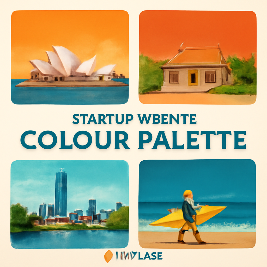
So, what’s the next move? Pick a primary hue that feels like your brand’s personality, layer it with a supportive accent, and keep the background calm. Then test, tweak, and repeat until the colours feel right and the pages feel alive.
And hey, if the design feels too heavy, go back to the mood board. You’re the curator; trust your gut and let the colours tell the story you want to sell.
🐣 The Chick Punchy advice, no fluff, and occasional chicken puns.
Let’s be honest – picking a platform feels a bit like picking a car when you’ve never driven one before. You want something that can carry you from zero to launch, keeps you safe, and doesn’t cost an arm and a leg.
First up, ask yourself: What’s the single thing you need the platform to do for you? A coffee‑shop owner in Brisbane wants a clean online menu and an easy checkout. An ecommerce wholesaler needs robust inventory tools. Knowing this one goal keeps the decision process from turning into a feature‑feud.
Startups often stretch every dollar. Platforms come in three flavours: free, low‑cost monthly plans, and enterprise‑grade tiers. The free tier is tempting, but watch for ads, limited storage and no custom domain.
When you’re ready to spend, consider the all‑inclusive package – hosting, SSL, backups and customer support – that keeps maintenance off your plate.
Build a quick feature matrix: e‑commerce, booking system, blogging, SEO tools, mobile optimisation, integrations with accounting or CRM software. Then line up each platform against that list.
For example, Wix offers a drag‑and‑drop editor and a wide range of templates, plus a built‑in booking app – great for local services. Squarespace shines with its polished design templates and deep SEO controls, which is handy if your brand relies heavily on visual storytelling.
It’s worth testing a free trial or sandbox to see how the editor feels. A platform that feels like a toy is a sign you’ll need to spend extra time learning it, which takes away from running your business.
Startups grow fast. Pick a platform that scales without a migration nightmare. Look for data export tools or an ability to move to a self‑hosted WordPress site later.
Support matters, too. A platform with 24/7 chat or a community forum can be a lifesaver when you’re stuck after midnight.
Think about future features – add‑on marketplaces, multi‑currency, or a mobile app. A flexible platform will let you plug those in as your revenue grows.
| Feature | Wix | Squarespace | WordPress + Hosting |
|---|---|---|---|
| Drag‑and‑Drop Editor | ✓ | ✓ | ✗ (requires theme customisation) |
| Built‑In E‑commerce | ✓ | ✓ | ✓ (via plugins) |
| SEO Controls | Basic | Advanced | Full‑control (requires knowledge) |
To read more about the strengths and limits of each, you can check out a comprehensive review of the best website builders on PCMag’s top builder list. It gives a handy side‑by‑side look at pricing, features and the learning curve.
Once you’ve narrowed your choices, sign up for a trial on each platform. Spend a couple of hours building a mock homepage. Pay attention to load times, the ease of adding a product, and how quickly you can tweak colours.
Ask a friend or a small business peer to critique the result. Their fresh eyes can catch usability quirks you miss.
Write down a pros‑and‑cons list for each candidate and tick off the most critical items for your startup’s launch. The platform that scores highest on your list – and feels natural to use – is the one that will keep you moving forward.
Remember, the right platform isn’t about having the most bells and whistles. It’s about a tool that lets you deliver your product or service to customers quickly, reliably, and with the flexibility to grow.
🐣 The Chick Punchy advice, no fluff, and occasional chicken puns.
Okay, you’ve got your vision nailed down. Now it’s time to turn that story into a skeleton that designers and developers can actually build. Wireframes are like the blueprints of a house – you don’t need to paint the walls yet, but you do need to know where the doors and windows go.
In practice, the first thing you do is draw a rough map. For visual examples, check out wireframe examples. Think of a 2‑column layout: a header, a hero block, a few content sections, and a footer. Use sticky notes or a whiteboard if you’re in person, or a free tool like Miro. Keep it simple – just boxes and labels. This lets you spot odd placements before anyone writes CSS.
Now that you have the skeleton, throw in the hierarchy. Which elements need to grab attention first? Put the primary CTA in the top right of the hero, make the headline large, and keep secondary links out of the way. In a coffee‑shop e‑commerce page, that “Order Now” button should sit where the eye lands first.
Wireframes should be a conversation, not a static image. Share the draft with a handful of potential customers and ask, “What’s the first thing you notice? Is the navigation obvious?” Capture their thoughts and tweak the layout. A single misplaced button can trip up a user and hurt conversion.
Before you add colour or typography, simulate the path a visitor will take. Click through a prototype in Figma or Adobe XD and make sure every link works. If you’re building a booking page for a local salon, you should be able to pick a date, see availability, and confirm without getting lost.
Research shows that people scan web pages in an F‑shaped pattern. That means the top and left side get the most eyeballs. Place key messages there and use size, contrast, and whitespace to pull the gaze deeper into the page. When you do this right, you’ll see a noticeable drop in bounce rates. For more on visual hierarchy, see this guide to UX design best practices.
Contrast, font size, and keyboard navigation are all part of UX. A quick check with a tool like Colour Contrast Analyser (free) can flag low‑contrast elements before you lock in a palette. Remember, a great design looks good on a phone, a laptop, and a screen in the sun.
Once you’ve approved the structure, layer in a style guide that captures the brand’s colours, fonts, and button shapes. This keeps the development team aligned and speeds up hand‑off. In practice, you’ll hand the team a single PDF that shows the header in two variants, the CTA button style, and the hero background shape.
After launch, use analytics to spot friction points. If the “Add to cart” click‑through drops, revisit that section of the wireframe. Small tweaks—like moving the button closer to the product image—can lift conversion by 5‑10 %.
For a small business, every pixel counts. A clear wireframe means faster development, fewer rework cycles, and a site that feels intuitive to your customers. It also gives investors a concrete view of how you’ll scale without redesigning from scratch.
That’s the wireframe sprint in a nutshell. You’re now ready to jump into the design phase with confidence. Keep the conversation going, test early, and watch the user experience grow from a sketch to a polished launch.
🐣 The Chick Punchy advice, no fluff, and occasional chicken puns.
First off, think about where most of your customers are scrolling – usually on their phones.
In our experience, a simple breakpoint tweak can lift mobile conversion rates by up to 12 %. That’s the magic of responsive design: the same codebase reshapes itself to fit the device, so you don’t have to build a separate mobile site.
Here’s a quick how‑to you can run through in under an hour:
Sketch the core journey on a phone screen: headline, image, CTA, and a single navigation button. Keep the hierarchy tight – the headline on top, the CTA immediately below, and the rest tucked into a collapsible menu. Test the flow with a friend by flipping their phone and seeing if they can find the “Order Now” button in one glance.
When you code, avoid hard‑coded pixel values. Use percentages or CSS flexbox to let elements stretch or shrink. If a product image is set to 400 px wide, it will still be huge on a 320 px screen. Instead, set max‑width: 100%; height: auto; and the browser will do the rest.
On small screens, space is premium. Strip out non‑essential text, reduce paragraph length, and make your headline punchy. A headline that reads, “Fresh Brisbane coffee – order online” does the job in two words. The rest can slide in on scroll.
Buttons should be at least 48 × 48 dp in size, give them a little padding, and make sure the tap target doesn’t overlap with other elements. Users on a 5‑inch phone will thank you when they don’t accidentally click the wrong link.
Tools like Chrome DevTools let you switch between phone, tablet, and desktop. Load your page, look for layout glitches, and check that images aren’t blurry or stretched. If something breaks on the iPhone 12 screen but not on a phone‑size Android, tweak your CSS media queries until it works everywhere.
Large JPEGs can double load times on 3G connections. Compress images with WebP or next‑gen formats, and serve a low‑resolution placeholder that fades into the full image. Lazy‑load anything below the fold so the initial paint is fast and the user feels instant.
Inline only what’s needed for the first paint. Defer non‑essential scripts until after the page has rendered. If you’re using a framework, look for ways to tree‑shake unused code – every byte saved is a quicker mobile experience.
Do you ever wonder why your mobile conversion dips after a redesign? The answer is usually a small oversight in one of these steps. Keep the checklist handy, test on real devices, and tweak until the user feels the flow feels natural.
And remember, a mobile‑friendly site is not a bonus – it’s a necessity for Brisbane small business owners who want to order on the go. By making your site feel at home on any screen, you’re saying “I’ve got you covered, no matter how you get here.”
🐣 The Chick Punchy advice, no fluff, and occasional chicken puns.
It’s launch day. The site is live, but that’s just the first beat of the song. What comes next is a steady drumbeat of testing, tweaking, and learning. If you skip this part, you’ll be stuck with a website that looks good in your head but feels like a paper plane to real users.
Before you hit the big red button, run through a quick pre‑launch sanity check. Confirm that all internal links point to the correct pages, forms submit properly, and the checkout flow doesn’t leave any hidden steps. If you’re unsure, borrow a checklist from Digital Silk’s launch checklist – it’s a solid starting point that covers the essentials.
Take a minute to do a “last‑minute walk‑through.” Pretend you’re a customer in Brisbane buying that artisan coffee online. Can you find the menu? Do the prices load? Does the “Order Now” button sit where you expect it? If any of those answers are “no,” you’ve got work to do.
Once you go live, capture every click. Set up basic analytics with Google Analytics or a lightweight alternative. Track page views, bounce rate, and conversion funnels for the next 24 hours. That data tells you if users are dropping off or if your CTA is doing its job.
Don’t forget performance. Use a tool like EdgeOne’s speed test tool to check how fast the site loads from Sydney and beyond. A slow start can kill confidence before the first sale.
Once you’ve got data, look for patterns. Maybe the bounce rate spikes on the product page. Maybe the checkout page takes too long to load. Those are your pain points. Don’t try to fix every possible issue at once – pick one or two that affect the most users.
Run A/B tests on small changes. Swap the colour of the “Add to Cart” button, shorten the checkout form, or move the CTA to the top of the page. Even a 1% lift in conversions can translate to extra sales or leads for a small business.
A local café in Brisbane launched a new menu page with a “Reserve Table” button. After launch, the bounce rate on that page jumped to 70%. They discovered the button was hidden behind a dropdown menu on mobile. Moving the button to the top of the hero area reduced the bounce rate to 35% and increased table reservations by 18% in the following week.
That’s the power of iteration – you’re not guessing; you’re measuring and reacting.
Keep the momentum going. Schedule monthly reviews of analytics, performance, and user feedback. If a new feature is added, repeat the launch‑test‑iterate cycle. Treat the website as a living product rather than a one‑and‑done project.
Set up alerts for downtime or high error rates. A simple uptime monitor can flag problems before customers notice. And always keep your CMS, plugins, and hosting environment up to date – security patches are just as important as new features.
If you feel stuck, consider hiring a specialist for a quick audit. A fresh pair of eyes can spot usability issues you’ve become blind to. Remember, you don’t have to do everything yourself. At Free Website Chick, we can jump in for a sprint to clean up those last bugs and fine‑tune the user flow.
And if you’re looking for deeper insights, tools like Google Search Console can reveal which queries bring traffic and which pages might need a nudge. Use that data to keep your content and SEO aligned with what users actually want.
Once you tick those boxes, you’re ready to keep the website growing. The launch is just the first chapter – the real story starts when you listen to the data and keep iterating.
🐣 The Chick
Punchy advice, no fluff, and occasional chicken puns.
A free builder is all you see on the dashboard – you drag elements, pick a theme, and pay nothing upfront. You usually get limited customisation, auto‑ads, and you’re stuck on the provider’s infrastructure. A managed hosting plan, like the one Free Website Chick offers, gives you full control over your domain, SSL, backups, and the freedom to add e‑commerce or bespoke plugins. It’s a bit pricier, but you own the ship.
If you’ve already nailed your brand vision, a clean design can go live in a week. We split the work into three stages: wireframe and approval (2‑3 days), copy and asset upload (1‑2 days), and final QA and launch (2 days). The key is to keep the scope tight and avoid scope creep; that’s how you stay on schedule.
Not at all. We hand over a dashboard that feels like a spreadsheet – you can add pages, update text, and see analytics in real time. For more complex tweaks, our support team can do the heavy lifting. Most updates are just a few clicks, so you’ll feel confident managing it yourself.
Yes, you can. Start with keyword‑rich headings, descriptive meta tags, and clean URLs. Use Google Search Console to spot crawl errors and find the queries that bring traffic. If you hit a wall, we can review your setup and suggest tweaks. The goal is to make the site speak to both users and search engines.
Absolutely. We keep the CMS, plugins, and server patched daily. We also run automated security scans and set up firewall rules. If a vulnerability shows up, we patch it within 24 hours. That way you’re protected, and your customers stay confident in your site.
Adding a shop is a simple toggle in most CMS platforms. We’ll set up product feeds, payment gateways, and a checkout flow that matches your brand. We also optimise the store pages for speed and mobile, so your customers can add to cart without a hiccup. Think of it as adding a new chapter to an already great story.
We’ve walked through the nitty‑gritty of website design for startups, from branding to launch. Now it’s time to turn that knowledge into action.
First, grab the cheat‑sheet we handed you: keep your core values front‑and‑centre, make navigation a conversation, and test every button as if it’s a lifeline.
Next, roll out the analytics you’re already tracking – Google Analytics, Search Console or whatever you prefer – and look for the first 24‑hour spikes or dips.
If something feels off, treat it like a mystery and chase the culprit with A/B tests or quick tweaks; 1‑2% lifts can mean real money for a small business.
And remember, the website isn’t a one‑off project – it’s a living, breathing brand story that evolves with your customers.
So what’s your next move? Take the checklist, run a quick test, tweak, and repeat until the conversion feels like a natural conversation.
You’ve got the tools, you’ve got the plan, and you’ve got a support network that’s ready to jump in when you hit a snag.
Keep the conversation going – tweak, test, repeat – and soon you’ll see the kind of traffic that turns into paying customers.
Happy building, and if you ever feel stuck, just give us a shout; we’re here to help make your site sizzle.