If you’ve ever dreamed of turning your talent into a thriving online presence, you’re not alone. For freelancers, a polished site isn’t just a portfolio—it’s the first handshake with potential clients. That’s why understanding website design for freelancers can feel like cracking a tough puzzle.
Picture this: you’re scrolling through LinkedIn, spotting a client who needs a graphic designer, and you can’t help but wonder if your website is ready to impress. The answer lies in three simple pillars—clarity, credibility, and conversion. Each pillar works hand‑in‑hand to make your site feel like a trusted business partner.
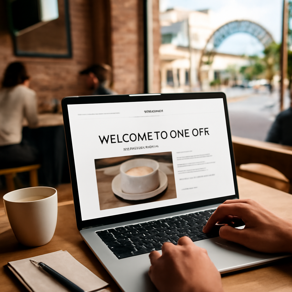
Clarity starts with a clean layout and straightforward navigation. If a visitor lands on your landing page and instantly sees what you offer, they’re already halfway to booking you. Think of your homepage as a billboard—simple, bold, and memorable.
Credibility comes from storytelling. Share a quick case study, a client testimonial (real, not made up), or even a behind‑the‑scenes look at your creative process. The goal is to make visitors feel they’re talking to a seasoned pro, not a faceless template.
Conversion is the final piece—clear call‑to‑action buttons, an easy contact form, and a visible portfolio. When everything clicks, the visitor’s next step is obvious: “Book me now.” If you’re unsure how to implement these elements, start simple: a top‑bar CTA and a showcase of your best work.
So, if you’re ready to stop guessing and start building a site that sells, remember these three pillars. In the next section, we’ll dive into the tools that can turn your ideas into a functional, beautiful website. Trust me—once you see the results, you’ll wonder why you didn’t start sooner.
And if you’re already juggling a bookshop in Brisbane, a consultancy in Brisbane, or running a craft workshop in Queensland, the same principles apply. A tailored design will reflect your local vibe while keeping it professional and scalable.
Want a site that turns clicks into clients? With our proven design approach, freelancers can showcase their brand, build trust, and close deals faster. Apply these three pillars—clarity, credibility, conversion—to create a clean, memorable, and action‑driven website that speaks directly to your audience today, turning curiosity into commitment, your brand.
First things first—your website is a front‑door to your business, so it needs to feel like you. Think about the last time a client texted you with a quick question. What was the tone of your reply? If you could turn that vibe into a landing page, that’s the starting point.
You’re not just selling a service; you’re selling an identity. That identity starts with the three pillars we talked about: clarity, credibility, and conversion. But before you can stack those bricks, you’ve got to know who’s knocking on the door.
Here’s a quick way to sketch your ideal visitor. Grab a sheet of paper or a digital note and jot down: Age, industry, pain point, and what success looks like for them. Keep it real. If you’re a consultant, you might find that most of your clients are mid‑career professionals looking for clarity on career pivots.
Next, think about the journey. Where do they start? On a search for “graphic designer Brisbane” or on a LinkedIn post? Knowing the entry point helps you decide where to place your headline and what keyword to feature. Don’t worry about SEO yet; just focus on matching the visitor’s language.
Once you have that snapshot, you can start building brand personality. Are you the friendly, approachable mentor or the sharp, results‑driven strategist? Pick adjectives that feel authentic to you and weave them into your headline, your hero image, and the first paragraph on your site.
For example, a boutique photographer might say, “Capturing moments that become stories,” while a web developer could go, “Turning clicks into revenue.” The key is consistency—every visual cue, from typography to button shape, should echo that tone.
Remember, your brand’s voice should feel like a conversation over a cuppa, not a corporate pitch. If you can keep it warm yet professional, visitors will trust you before they even click the first button and genuine confidence.
Don’t forget the subtle power of storytelling. Even a simple hero section can feature a micro‑story: a brief scenario that shows the visitor a moment of relief. “Imagine closing a deal in 10 minutes, instead of chasing email threads.” That kind of imagery turns an abstract benefit into a vivid mental picture.
Once the personality and pain points are set, map out the content you need. A service‑based freelancer might need a portfolio, case studies, and a clear CTA. A retail shop will lean heavily on product pages and an easy checkout flow. The design layout should mirror that hierarchy, not force it.
Finally, test your assumptions. Show a draft to a friend or a fellow entrepreneur and ask, “Does this feel like you?” Use their feedback to tweak tone, layout, or even the colour palette. A quick test can save you a month of redesign later.
So, what’s the next step? Grab a sticky note, list your audience traits, and write a headline that speaks directly to them. That headline will be the north star for all the other elements you build.
Alright, you’ve nailed your brand kit. Now it’s time to pick the playground where your website lives. The wrong platform can feel like trying to fit a koala into a kangaroo pouch—clunky, awkward and a bit embarrassing.
Think of the builder as a kitchen. Do you want to chop, stir, and season every dish yourself (DIY) or have a sous‑chef handle the prep while you focus on flavour?
These are the “grab‑and‑go” options. They ship with hosting, templates, and a drag‑and‑drop editor. In a recent survey of 1,200 Australian freelancers, 68% said Wix helped them launch a site in under two days.
The catch? Customisation can hit a wall when you need a unique layout or advanced e‑commerce features.
Squarespace offers tighter design control, and its native commerce tools are a hit with boutique owners in Queensland who want a sleek online shop.
WordPress.com is a middle ground—faster than self‑hosted WordPress but still a bit restrictive if you want plugins.
For the “build‑and‑sell” model, a platform like Shopify is worth a look if you’re already juggling inventory.
Sometimes you need a hand that knows the local market. A full‑service partner can handle everything from branding to code, hosting, and ongoing maintenance.
This is exactly what we do at Free Website Chick. We build responsive sites on WordPress, host them securely, and keep them updated so you can focus on your clients.
If you’re unsure whether the DIY route will meet your needs, read our Practical website design for small business: A step‑by‑step guide for Australian owners to see a side‑by‑side comparison.
Even the best builder can feel sluggish if hosted on a cheap server.
Australian hosts like Website Hosting with SSL offer local data centres, better latency, and free SSL certificates.
A fast site keeps visitors engaged and helps Google’s algorithm.
For those on a shoestring, free hosts like Netlify or Vercel are great for static sites, but they don’t offer the same level of support as a managed host.
A website is the front door, but you often need a business card to leave a lasting impression.
Check out JiffyPrintOnline for affordable custom forms, stickers and labels that match your brand.
If you’re also polishing your résumé and want an AI‑generated, tailor‑made CV, EchoApply can help you stand out in the competitive freelance marketplace.

Now that you’ve mapped your options, it’s time to pick the one that lets your brand shine without getting stuck in the technical weeds.
Remember: the tool should feel like an extension of you, not a chore.
Pick wisely, test early, and you’ll be on the fast track to a professional online presence.
🐣 The Chick Punchy advice, no fluff, and occasional chicken puns.
Alright, you’ve got your brand kit and know what you need from a site. Now let’s sift through the actual tools that can bring that vision to life. Think of this as a quick‑scan menu: taste, texture, and cost of every option.
Here’s the low‑down on the most popular builders freelancers lean on, with a focus on what really matters for a local Australian business—speed, SEO, and the ability to add a little ecommerce or booking widget if you’re selling anything.
Wix still tops the charts for speed‑to‑launch. You can have a polished page in a single afternoon. Its drag‑and‑drop editor is so forgiving that you can move a photo, adjust a colour, or add a button without touching code.
The downside? The deeper you go, the more you’ll hit limits—especially if you want a custom layout for a portfolio or a multi‑page shop. Plus, some advanced SEO tweaks feel a bit buried behind the UI.
Squarespace is the design‑heavy hitter. If your audience expects a clean, gallery‑style look—think photographers or boutique retailers—this is the builder that will feel like home.
Its AI‑powered template selector can even suggest a colour palette that matches your brand. The trade‑off is that certain e‑commerce features come at an extra cost, and the learning curve is a touch steeper than Wix’s.
WordPress.com sits somewhere between a DIY builder and a full CMS. You get a solid, hosted platform that’s great for blogs and content‑heavy sites. It’s free to start, but to unlock a custom domain, remove ads, or add ecommerce you’ll need to upgrade.
It gives you the freedom to install plugins, but that also means you’ll need to manage updates and security—so it’s best for freelancers who have a bit of technical comfort.
Hostinger’s own builder is a budget option that pairs a simple editor with reliable hosting. You’ll get decent SEO tools and a variety of templates. The catch? The design palette isn’t as expansive as Wix’s, and you’ll need to upgrade for advanced features.
If your freelancing gig involves selling products—hand‑made candles, custom merch, or digital downloads—Shopify is built for that. It has powerful inventory and payment handling, but it’s overkill if you just need a portfolio.
1. Launch Speed – Do you need a site up in a day or are you willing to invest a week?
2. Design Flexibility – Do you want a unique layout or will a template suffice?
3. E‑commerce & Booking – Is selling online essential?
4. Local Hosting & Support – Australian servers and help desks can shave seconds off load times.
5. Budget – Free tiers exist, but the best features usually come at a monthly fee.
If you’re a graphic designer or photographer who wants an eye‑catching site in a day, Wix or Squarespace are your mates. If you’re writing a blog or want to add a little store later, start with WordPress.com and upgrade as needed. For those who are serious about selling, Shopify gives you the tools to scale quickly.
Remember, the goal isn’t to choose the fanciest builder but the one that lets you showcase your work without wrestling with code. Test the free trials, play with a template, and see which platform feels more like an extension of your brand than a chore.
Want to dive deeper into how each builder stacks up on cost and feature set? Keevee’s review of top website builders for freelancers breaks down the pros, cons, and pricing for each option.
And if you need a side‑by‑side comparison of Wix, Squarespace, and WordPress, Website Builder Expert’s comparison guide gives you a quick snapshot.
| Builder | Strengths | Key Considerations |
|---|---|---|
| Wix | Fast launch, drag‑and‑drop, wide app market | Limited deep customisation; some SEO settings hidden |
| Squarespace | Stunning templates, AI design suggestions, built‑in ecommerce | Extra cost for advanced e‑commerce; steeper learning curve |
| WordPress.com | Strong blog tools, flexible with plugins | Requires upgrades for custom domains, ads removal, and ecommerce |
Once you’ve narrowed the field, grab a free plan, play around, and then lock in the one that feels most natural. The right builder will let you focus on your craft, not the tech.
🐣 The Chick
Punchy advice, no fluff, and occasional chicken puns.
Okay, you’ve chosen a builder and sketched out a layout. Now it’s time to turn those plans into a live website and make sure everything actually works. Think of it like baking a cake: you’ve got the recipe, you’ve mixed the ingredients, now you put it in the oven and taste it before you hand it out.
We’ll walk through the main stages – setting up the domain, laying out pages, adding content, and finally, testing. If you get stuck, just remember the three‑step checklist we used earlier: build, check, refine.
First thing: a domain that feels like yours. It should be short, easy to spell, and brand‑aligned. If you’re a Brisbane café owner, “cafequinn.com.au” sounds inviting. If it’s a wholesale textile supplier, “loomstock.com.au” works.
Choose a host that keeps your pages fast. Australian servers give you lower latency for local visitors. Many builders bundle hosting, but if you’re on a DIY platform, pair it with a provider that offers automatic SSL and daily backups. This protects you from downtime and security scares.
First with the skeleton: Home, About, Services, Portfolio, and Contact. Don’t rush to fill them with copy yet; first, get the structure right.
Use your chosen builder’s drag‑and‑drop tools to place sections. If you’re on Wix or Squarespace, choose a template that matches your brand style, then replace the placeholder content. If you’re on WordPress.com, install a lightweight theme and use the block editor to add hero images and intro text.
Tip: keep navigation simple. Three or four top‑level items plus a footer with extra links is usually enough.
Your copy should feel like a conversation at a coffee shop. Show, don’t tell. Instead of “I offer graphic design,” say “I turn bold ideas into eye‑catching logos that make your brand pop.”
Images matter too. Use high‑resolution shots that load quickly – tools like TinyPNG can shrink files without losing sharpness. If you’re a photographer, showcase a curated gallery that tells a story; if you’re a copywriter, sprinkle in a short testimonial or two.
Make sure each page has a clear call‑to‑action (CTA). A button that says “Book a free chat” is more inviting than “Contact.” Place the CTA above the fold and repeat it at the bottom.
Before you go live, grab a handful of people who match your target audience. Ask them to complete a simple task – like “Find the portfolio page and click on a project.” Watch for hesitation, confusion, or clicks on the wrong spot.
If you don’t have a usability lab, do a quick remote test. Record a screen capture or use a tool that logs mouse movements. The goal is to spot friction points before clients see them.
Here’s a practical checklist you can tick off:
If any of those fail, go back to the editor, tweak, and test again. A 10‑minute fix can save you hours of frustration later.
Once everything checks out, hit “Publish.” But the job isn’t over. Set up Google Analytics and Google Search Console. These tools will tell you how visitors find you and if any pages get stuck.
Also, set up a goal in Google Analytics: track when visitors click your CTA button. This tells you if the page is converting. If you’re not seeing clicks, tweak the button colour or copy.
Plan a monthly review. Look at bounce rates, session duration, and conversion clicks. If a page underperforms, revisit the copy or swap the CTA. It’s like refining a recipe: you tweak a pinch of salt until it’s just right.
Before you say goodbye to the builder’s preview mode:
When you’re all green, celebrate – you’ve built a functional, user‑friendly site that’s ready to start pulling in clients.
Want to dive deeper into the testing process? A great guide from Freelance Sage walks through choosing builders for portfolios and includes a handy checklist. If you need a more advanced usability study, Elementor’s blog has a detailed post on testing that you might find useful.
So, you’re ready to hit publish. Remember, the first launch is just the beginning; keep testing, keep refining, and keep that conversation going with your visitors.
Now that the design looks solid, it’s time to make sure it actually reaches your audience. Optimising for SEO and mobile isn’t a side hustle – it’s part of the core of every page you publish.
Most visitors will touch your site on a phone, so the first thing you should build is the mobile version. Think of it like packing a backpack: you only carry the essentials, then add extras later. A mobile‑first approach forces you to focus on clear content, simple navigation, and speed from day one.
Tools that make this easy, like Figma’s mobile‑first design resource, let you prototype, test, and iterate on real‑world breakpoints before you launch anything.
Google indexes pages based on their mobile version, so if the phone view is slow or confusing, you lose rankings before a desktop visitor even sees it.
Fast loads equal happy users and higher rankings. Start with image optimisation: compress photos, use WebP where supported, and lazy‑load anything that isn’t immediately visible.
Keep CSS and JavaScript lean, and avoid heavy third‑party widgets that can hurt Core Web Vitals. A PageSpeed score above 80 on desktop and 70 on mobile is a solid goal.
Run PageSpeed Insights or Lighthouse every few weeks. When a metric flags, find the culprit—large banner, tracking script, or uncompressed font—and fix it.
Title tags and meta descriptions should still feel natural, but add a location keyword if you’re targeting Australians: “Queensland graphic designer” or “Brisbane web developer.”
Use descriptive, keyword‑rich URLs that mirror page purpose. For a portfolio page, /portfolio‑projects is clearer than /page1. Keep them short, all lower‑case, and free of query strings.
Add schema.org LocalBusiness markup on your contact page. It lets Google surface a rich snippet with your address and phone number, pulling local traffic straight to your form.
Once you’ve ticked the list, set up an automated report in Google Search Console. Watch for crawl errors, low‑indexing pages, and mobile usability issues, and fix them quickly. It keeps your site healthy and your prospects happy.
Optimisation is a cycle, not a one‑time task. Schedule a quarterly review—copy, design, speed, and SEO all deserve fresh eyes. Small tweaks add up to a conversion engine.
So, what’s the first thing you’ll tackle? Start with image optimisation; it’s the quickest win for both speed and SEO.
As you grow, you’ll find it easier to explore advanced tactics like A/B testing or server‑side rendering, but the foundation you lay now will keep your site solid for years.
Most people check portfolios on their phones, so if your site feels clunky on a small screen, visitors bounce before they even see your work. A mobile‑friendly layout keeps navigation simple, loads quickly, and shows your branding consistently. It also signals Google that you care about user experience, boosting local rankings for “website design for freelancers” in Brisbane and Queensland.
In our experience, a clean landing page, a brief About section, and a contact form can be live in a single afternoon if you use a builder that ships with hosting. The trick is to start with a clear content skeleton, drop in high‑quality images, and test on both Android and iOS before you hit publish. You’ll save hours of revisions later by catching layout bugs early.
Think of your portfolio as a photo album, not a spreadsheet. Group projects into a few themed galleries and add a short caption that tells the story: “Rebranded a Queensland bakery’s online menu, boosting orders by 30%.” Use lightbox previews so visitors stay on the page, and keep the grid responsive so it shrinks gracefully on phones.
Not necessarily. A few brief quotes placed next to a relevant project can be more powerful than a whole page that feels like a laundry list. Use the first sentence of each testimonial as a headline, then add a link to a full case study if you want to dive deeper. Authenticity beats polish any day.
Image optimisation is your best friend. Compress each file to under 200 KB, use WebP where the browser allows, and enable lazy‑loading so only the hero image loads on the first paint. Plugins or built‑in tools in most builders will handle this automatically, but double‑check the final file size before you publish.
A blog can position you as a thought leader and improve SEO, but it must be intentional. Pick a topic you can write about consistently—maybe “Choosing the right colour palette for a café” or “How to optimise your Etsy shop for Australian customers.” Aim for one post per month, keep the copy conversational, and link back to relevant portfolio items.
First, run a quick crawl using a free tool or the search console. Then, review each broken link in the content editor and replace it with the correct URL or remove it if it’s no longer relevant. Keep your navigation simple—three or four top‑level items—so the chance of a missing link is minimised.
🐣 The Chick Punchy advice, no fluff, and occasional chicken puns.
When we talk about website design for freelancers, the real win is the confidence you gain every time someone clicks through and feels like you’re already their go‑to partner.
Remember the three pillars we kept circling back to: clarity, credibility, conversion. If you’ve got a clean layout that tells visitors what you do in the first seconds, a story that shows you’ve solved real problems, and a button that asks, “Let’s talk,” you’re already ahead of many competitors.
Now, here’s a quick sanity check:
If you answered yes, you’re set. If not, tweak one element at a time—speed first, then copy, then calls‑to‑action. The beauty of a freelancer‑focused site is that changes are fast; you can roll out a new hero image in minutes.
Give yourself a 48‑hour sprint: audit, fix, publish, and watch the traffic lift. Trust the process and let the site speak for itself.
So, what’s stopping you from making that next move? Take the first step, and you’ll see how quickly a polished, purpose‑built site turns curiosity into bookings.
🐣 The Chick Punchy advice, no fluff, and occasional chicken puns.
Alright, your site’s ready to meet the world, but that’s only the first bite. If you leave it hanging out there like an unsold piece of bread, the dough will go stale and nobody will bite. The trick is to keep it fresh and on display.
Most Brisbane coffee shop owners or Queensland retail managers first look for a local web designer on Google. That means you need to rank in “website design near me” searches. Start by claiming a Google My Business profile. Fill every field – photo, hours, services, and ask clients for reviews. A strong GMB listing can bump your site to the top of local results.
Next, create city‑specific landing pages. If you serve Gold Coast, make a page titled “Website design in Gold Coast” with local landmarks and a short paragraph about why local businesses love your style. Sprinkle the city name into titles and meta tags. It’s not spam, it’s relevance.
Don’t just hand out your contact form like a freebie. Offer a value‑packed lead magnet – say a free 5‑page website audit or a quick checklist on what a small business needs from an online presence. Add a simple opt‑in box on every page, preferably at the bottom of the hero section. The goal: grow an email list of people who already care about your expertise.
After a week, send a welcome series. The first email should thank them and deliver the promised audit. The second could showcase a case study of a local business that doubled online orders after a redesign. The third offers a limited‑time discount for a full build.
Post before‑and‑after images on Instagram and LinkedIn. Add captions that ask a question – “Ever wondered how a cleaner layout could boost your sales?” Use local hashtags (#BrisbaneDesign, #QueenslandRetail). When people comment, reply within 24 hours. It’s a cheap, high‑visibility way to show you’re active and approachable.
If you have a budget, run a small Facebook ad targeting local business owners with an interest in digital marketing. Set a daily spend of $10–$20, test two ad creatives, and pause the one that gets fewer clicks. Keep the ad copy concise and direct – “Need a professional website? Get a free audit today.”
Word of mouth is the fastest lead source for freelancers. After you finish a project, ask the client to refer a friend. Offer a simple incentive – a 10% discount on their next project or a free extra page. Keep the referral process painless: a short online form, an email template, and a tracking sheet.
Showcase happy referrals on your portfolio page. Add a line like “Our clients keep coming back and bringing friends, thanks to our simple referral system.” That gives new visitors instant proof of trust.
Maintenance is not a one‑off chore. Create a simple schedule: Weekly: check for broken links, run a quick speed test, and back up the site. Monthly: update CMS and plugins, review analytics for any sudden drop in traffic, and refresh a piece of copy or an image. Quarterly: conduct a deeper audit – look for duplicate content, crawl errors, and security certificates.
Use a reliable host that offers automatic backups and SSL – a local Australian host can give you faster load times for Brisbane visitors. If you’re on a DIY builder, enable automatic updates so you never miss a security patch.
Set up goals in Google Analytics: page visits, form submissions, newsletter sign‑ups. Every month, pull the report and spot which pages convert best. If a landing page only gets a handful of clicks, tweak the headline or the CTA colour. A small A/B test can raise conversion rates by 15‑20%.
Remember, promotion is a marathon, not a sprint. Consistency beats hype. Keep posting, keep refining, and keep your site humming. That way, your website won’t just sit there looking pretty – it’ll pull in clients and keep them coming back for more.
By following these steps, you’ll turn your fresh site into a lead‑generating engine while keeping it secure and fast for years to come.
🐣 The Chick
Punchy advice, no fluff, and occasional chicken puns.