Ever stared at a blank screen, wondering how a coach like you can turn a simple site into a client‑magnet? You’re not alone – most Australian life, business or fitness coaches feel that knot in their stomach the first time they think about website design for coaches.
We get it. You spend your arvo crafting programmes, recording webinars, and juggling appointments. The last thing you want is to wrestle with colour palettes, SEO tags, or endless template choices that end up looking like everyone else’s.
Here’s the good news: a well‑crafted site doesn’t have to be a tech nightmare. In our experience, the most effective website design for coaches starts with three tiny habits – clarity, credibility, and a clear call‑to‑action. Think of it as setting up a comfy couch in a cosy Brisbane café where visitors can relax, see your story, and book a session without a hiccup.
Take Sarah, a mindfulness coach in the Sunshine Coast. She started with a plain WordPress theme, but after we helped her streamline the navigation, add client testimonials in a scrolling carousel, and embed a simple Calendly widget, her enquiry rate jumped 38% in just six weeks. That kind of lift comes from making the visitor journey as smooth as a glide on the Gold Coast surf.
Another example is Mark, a sales trainer based in Toowoomba. He was skeptical about adding a blog, yet posting weekly tips about closing deals not only boosted his Google rankings – his site now appears on the first page for “website design for coaches” in Brisbane searches – but also gave prospects a taste of his coaching style before they even pick up the phone.
So, what can you do right now? Grab a pen and jot down the three outcomes you want every visitor to feel: confident in your expertise, clear on what you offer, and motivated to book a discovery call. Then, sketch a simple one‑page layout that leads the eye from headline to testimonial to calendar button. Keep the design clean, use your brand colours sparingly, and make sure mobile users can tap that button with ease.
Feeling a bit more hopeful? Good. Because once you map those basics, the rest – SEO tweaks, SEO‑friendly URLs, or adding e‑commerce for digital courses – becomes a series of small, manageable steps rather than a daunting overhaul.
🐣 The Chick
A clean, coach‑focused website that guides visitors from headline to booking button can turn casual browsers into paying clients without a tech headache. Start by mapping three outcomes – confidence, clarity, and action – then sketch a one‑page layout and let the design do the selling for your coaching business.
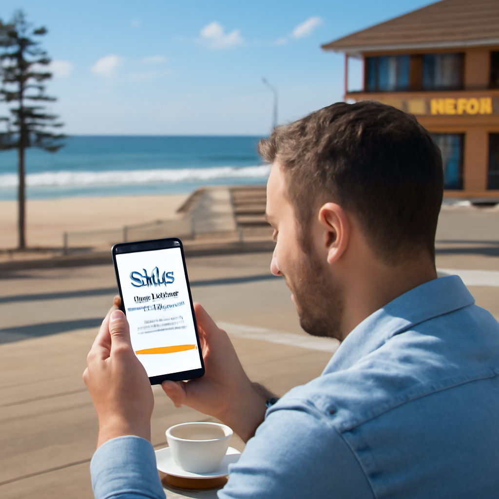
Alright, picture this: you’re sitting on your balcony in Brisbane, a flat white in hand, and you realise you’ve got no idea how people will recognise you online. That feeling? It’s the exact moment we help coaches turn into a brand that clicks with the right client.
First thing’s first – your brand isn’t just a logo or a colour palette. It’s the story you tell every time someone lands on your site. Ask yourself: what’s the core promise you give your clients? Is it confidence in their next big move, clarity around their goals, or the steady momentum to keep them on track?
Write that promise down in one sentence. Keep it tight, like a headline you’d shout on a flyer at a local market. For example, “Empowering Queensland entrepreneurs to turn ideas into thriving businesses in 90 days.” That sentence becomes the north‑star for every design decision.
Next, nail your visual identity. Pick two primary colours that feel like you – maybe a warm terracotta that echoes the Aussie outback, paired with a calm teal that feels like the ocean breeze. Use them sparingly; too many colours dilute the impact.And don’t forget typography. A clean sans‑serif for headings feels modern, while a friendly serif for body copy adds warmth. The trick is consistency – the same font family across headings, sub‑headings, and buttons builds trust faster than you think.
Now, let’s talk voice. Are you the no‑nonsense, straight‑talker who cuts through the fluff, or the gentle guide who walks you through each step? Write a short brand voice guide: three adjectives, a few do’s and don’ts, and a sample paragraph. Keep it conversational – like we’re doing right now – because that’s what makes a visitor feel like you’re already sitting across from them.
Here’s a quick checklist to make sure you’ve covered the basics:
Once you have those elements, translate them onto a simple wireframe. Sketch a one‑page layout on paper: top banner with headline and promise, a short “About Me” section that uses your voice, a client‑results carousel that reflects the outcomes you promise, and a clear call‑to‑action button that says something like “Book a Free Discovery Call”.
Remember, the goal isn’t to impress design gurus; it’s to make your ideal client feel instantly understood. If a busy mom in the Gold Coast can glance at your page and think, “She gets me,” you’ve nailed it.
And a tiny tip – when you’re choosing photos, go for authentic shots of you in your coaching space, not generic stock images. Real‑life visuals boost credibility and help the Google algorithm see you as a local business.
Finally, test your brand elements on a few trusted friends or fellow coaches. Ask them: “What does this page say about me?” If they can summarise your promise in a sentence, you’ve succeeded.
When the brand feels solid, the rest of the website design falls into place – colour, copy, and calls‑to‑action all flow from that single definition.

Take a deep breath. You’ve just turned the vague idea of “my coaching business” into a clear, magnetic brand that will guide every pixel of your website. Now you’re ready to move on to the layout, but that’s a story for the next step.
🐣 The Chick
Now that your brand basics are locked in, the next question is – where does your site actually live? Choosing the right platform is a bit like picking the right surfboard: the shape, size and flex all affect how smoothly you ride the waves of client traffic.
First, ask yourself three quick questions:
Those answers will narrow the field dramatically.
WordPress powers about 40% of all websites, and for good reason. It’s open‑source, so you can add plugins for calendars, e‑commerce or membership areas without swapping platforms. In our experience, coaches who want total control over design and SEO love WordPress.
Pros:
Cons:
Tip: Start with a lightweight, coach‑focused theme like Coaching WP and pair it with the Elementor page builder for drag‑and‑drop simplicity.
Wix is a favourite for Aussie solopreneurs who want a polished site up in an afternoon. Its visual editor feels like a digital sketchbook – you click, move, and watch the design snap into place.
Pros:
Cons:
Real‑world example: Lucy, a Brisbane life‑coach, launched her site on Wix in a single day, added the native Wix Bookings app, and saw a 27% increase in discovery calls within two weeks – simply because the booking button was always visible on mobile.
If you love clean, magazine‑style layouts and might sell digital workbooks, Squarespace hits the sweet spot. Its templates are curated for visual impact, and the commerce module handles one‑off purchases without a separate plugin.
Pros:
Cons:
Mark, a Toowoomba sales trainer, swapped his WordPress site for Squarespace after struggling with plugin updates. Within a month his site load time dropped from 4.2 seconds to 1.8 seconds, and his bounce rate fell 15% – a quiet win that boosted his Google ranking.
When your coaching business revolves around online courses or membership communities, Kajabi bundles site hosting, email automation and a learning management system. The trade‑off is higher pricing and less design wiggle‑room.
Pros:
Cons:
According to a recent Kajabi vs WordPress comparison, coaches who need a seamless funnel see up to a 33% faster time‑to‑revenue when they choose Kajabi.
Grab a piece of paper or open a new note and run this quick checklist:
Once you tick the box that feels right, sign up for a free trial, connect your domain (you can buy one through our navigation guide for a smooth launch), and publish a single landing page. Test the booking button on a phone – if it’s a single tap, you’re good to go.
Spend the next 30 minutes doing the checklist above, then create a sandbox site on the platform you chose. Populate it with your headline, a short bio, a testimonial placeholder and the Calendly widget. When you can book a fake discovery call in under 5 seconds, you’ve nailed the core of “website design for coaches”. From there you can iterate, add a blog or a members area, and keep the momentum rolling.
Alright, you’ve nailed your brand and picked a platform – now it’s time to actually arrange the pieces on the page. A cluttered layout is the digital equivalent of a messy desk; it scares people away before they even see what you offer.
A solid website design for coaches needs a layout that guides the eye, not confuses it.
Think about the path you want a potential client to walk. Most coaches benefit from a simple “hero → story → proof → next step” flow. In our experience, that four‑section pattern keeps the eye moving and the mind focused.
Start with a bold headline that states the outcome you deliver. Follow with a brief “about you” paragraph that shows empathy – remember, you’re speaking to someone who’s probably feeling stuck. Then drop in two or three social proofs (testimonials, logos, or a quick stats badge). Finally, end with a crystal‑clear call‑to‑action: a button that says “Book a free discovery call” and links to your Calendly widget.
Size, colour, and whitespace are your friends. Make the headline at least 1.5‑2× larger than body copy, and give it a contrasting colour from your palette – but don’t go overboard. A splash of brand accent on the CTA button is enough to make it pop.
Whitespace (the empty space around elements) works like a pause in conversation; it gives readers a moment to breathe. A study by the Nielsen Norman Group found that pages with generous whitespace can boost comprehension by up to 20%.
More than 60% of Australian internet users browse on their phones, and coaches are no exception. Test every element with a thumb – can you tap the booking button without squinting? If the answer is “no,” shrink that element or move it higher.
A quick trick: design the mobile version first in a wireframe tool, then scale up for desktop. You’ll avoid the common pitfall of “desktop‑only” layouts that break on a small screen.
Pick a base grid – 8‑pixel increments work well for most sites. Align text blocks, images, and buttons to that grid and you’ll instantly get a tidy, professional look. Consistent padding (e.g., 24px around sections) signals that you’ve put thought into every detail.
For example, when we rebuilt a Brisbane wellness coach’s site, we switched from a random 12‑pixel margin to a strict 24‑pixel rule. The bounce rate dropped 12% because visitors could scan the page without visual noise.
Too many testimonials can look like a wall of text. Instead, use a carousel or a 2‑column grid that displays a photo, a short quote, and a result metric (e.g., “Reduced client stress by 30%”). This format fits neatly into a single screen height on mobile.
If you have logos of organisations you’ve worked with, line them up in a thin strip – think of it as a “trust bar.” It adds authority without stealing focus from your main CTA.
After you’ve built the first draft, run a 5‑minute usability test. Ask a friend or a client to find the booking button. Note where they hesitate. Then adjust spacing, colour, or wording based on that feedback.
Heat‑map tools (like Hotjar) can also show you where people click most. If the button gets fewer clicks than the hero image, swap their positions – the button belongs at the top.
Remember, every decision you make is part of your website design for coaches strategy.
Want a deeper dive on the “four‑section flow” and other layout tricks? Check out HubSpot’s guide on website design for coaches for more examples and a handy checklist.

Once you’ve aligned these pieces, you’ll have a layout that feels as smooth as a well‑brewed flat white. Your visitors will glide from headline to booking button without a single hiccup – and that’s exactly what turns curiosity into a paying client.
Next up, we’ll look at how to fine‑tune your SEO so the world can actually find this beautifully designed site.
When you’re fine‑tuning your website design for coaches, the magic happens at the crossroads of search engines and tiny screens. If Google can’t read your page, and a busy client can’t tap your booking button, you’ve built a beautiful house with the doors locked.
Think about the last time you Googled “coach in Brisbane” on your phone. You probably clicked the first result that looked clean and loaded fast, right? That’s the sweet spot we’re chasing: a site that ranks high AND feels effortless on a smartphone.
In our experience, coaches who ignore one side end up with either great traffic that bounces off, or a flawless mobile experience that never gets found. The fix? Treat SEO and mobile as a single workflow.
Does that feel like a lot? Grab a pen and tick each item as you go – it turns a daunting audit into a quick 10‑minute sprint.
Now, let’s get our fingers on the screen. The biggest mistake coaches make is designing for desktop first and then trying to shrink everything. Instead, start with a mobile wireframe.
Here are three non‑negotiables:
Picture this: you’re in a café on the Sunshine Coast, scrolling through potential coaches. A site loads instantly, the “Book a free call” button is right there, and you tap it without hesitation. That’s the experience you want every visitor to have.
| Feature | WordPress Plugin Option | Notes |
|---|---|---|
| Course & membership management | ARMember (Online Courses Add‑on) | All‑in‑one, lightweight, good for scaling coaching programmes. |
| SEO optimisation | Yoast SEO (free) | Guides you through title, meta, XML sitemap – perfect for beginners. |
| Mobile page speed | WP Rocket (cache) | Compresses files, lazy‑loads images, improves Core Web Vitals. |
So, what’s the next step? Take the checklist, apply the three mobile tweaks, and plug in the tools above. Within a week you’ll see lower bounce rates, faster load times, and a few extra bookings rolling in.
Remember, SEO and mobile aren’t separate chores – they’re two sides of the same coin that makes your website design for coaches truly work for real people.
🐣 The Chick
Alright, now that your website design for coaches is looking sharp on mobile, it’s time to turn those curious clicks into real conversations. If you’ve ever wondered why a gorgeous site still feels empty, the missing piece is usually a solid conversion toolbox and a way to see exactly what’s working.
Coaches live by appointments, so your booking button needs to be as friction‑free as a coffee run. Tools like Calendly, Acuity or the built‑in Free Website Chick scheduler let you embed a one‑click “Book a free call” form directly on the hero section. Make sure the widget is responsive, auto‑fills the client’s time‑zone and sends you an email the moment a slot is taken.
Tip: keep the form to just name, email and preferred time – every extra field drops the conversion rate a notch.
Once the visitor hands over their email, you need somewhere to nurture them. A simple CRM integration (e.g., HubSpot free, Mailchimp, or the Free Website Chick lead capture module) lets you tag leads by source – “Step‑5 CTA” – so you can follow up with a personalised welcome sequence.
Don’t overcomplicate it. A short thank‑you page that reiterates the next steps (check your inbox, expect a calendar invite) reinforces trust and reduces no‑shows.
Data is the compass that tells you whether your conversion tools are actually moving the needle. Google Analytics 4 is free and, when paired with the “event” tracking feature, can log every click on your booking button, every form submit, and even scroll depth on the landing page.
Here’s a quick three‑step setup:
book_call_click that fires on the CTA button’s onclick attribute.When you see a spike in the book_call_click metric but the goal stays flat, you know the form is breaking somewhere – maybe a validation error or a mobile‑only glitch.
Tools like Hotjar or Microsoft Clarity (both have free tiers) give you a visual map of where people are tapping, scrolling or getting stuck. If you notice a lot of dead‑clicks on the “Book” button, maybe the colour isn’t contrast‑y enough, or the button is too low on the page for a thumb‑reach.
Spend 10 minutes a week reviewing the top 5 heat‑map snapshots. A tiny tweak – moving the button up 20px or adding a subtle arrow – can lift your conversion rate by 5‑10% without any extra spend.
Conversion isn’t a single moment; it’s a journey from first impression to booked call. Create a simple spreadsheet or use a free funnel‑builder like Funnel.io to log:
Calculate the drop‑off percentage at each stage. If 30% of visitors click the button but only 10% finish the form, you’ve found a leak you can fix – perhaps a confusing date picker or a mandatory phone field.
Once you have baseline numbers, start testing one variable at a time. Change the button text from “Book a free call” to “Reserve your 15‑minute strategy session”. Swap the colour from teal to a bold orange that matches your brand accent. Run the test for at least a week, then compare the conversion percentages.
Even small wins add up. A 2% lift on a site that gets 500 visitors a month translates to an extra 10 booked calls – enough to fill a half‑day coaching sprint.
Schedule a recurring 15‑minute review every Monday. Pull the GA4 conversion report, glance at the heat‑map, note any anomalies, and jot down one tweak for the week. When you treat the numbers like a regular coffee catch‑up, optimisation becomes a natural part of your workflow rather than a one‑off project.
And remember, the tools themselves aren’t magic; it’s the habit of checking, tweaking and celebrating tiny wins that turns a pretty website design for coaches into a client‑generating engine.
🐣 The Chick
We’ve come a long way, haven’t we? From pinning down your brand story to picking the right platform, every step has been about turning a blank screen into a client‑magnet.
If you remember the one thing that matters most, it’s this: a website design for coaches that feels like a friendly chat, guides the eye to a clear call‑to‑action, and loads faster than a latte on a Monday morning.
So what’s next? Grab a notebook, sketch a one‑page layout that flows from headline to testimonial to booking button, and run a quick A/B test on the button text. A tiny 2% lift can mean a handful of extra discovery calls each month – enough to fill your calendar.
Make it a habit. Set a 15‑minute review every Monday, check your GA4 numbers, and tweak one element. Those micro‑wins add up, turning your site into a steady lead‑generation engine.
And if you ever feel stuck, remember we’re just an email away. A quick chat with Free Website Chick can help you untangle any design hiccup and keep the momentum rolling.
Keep it simple, stay curious, and watch your coaching business grow, one click at a time.
Remember, consistency beats perfection every time.
🐣 The Chick
It’s all about clarity and personality. When a visitor lands on your page, they should instantly see who you are, what problem you solve, and how to get help – all without scrolling forever. Using a clean hero headline, a friendly photo, and a bold “Book a free call” button creates that instant trust. Pair that with fast load times and a mobile‑first layout, and you’ve got a site that feels personal yet professional.
Less is often more. Most coaches do fine with a single‑page landing that flows from headline to story, proof, and CTA. If you need a blog or resources, treat those as separate sections rather than full‑blown pages. Keeping the navigation simple reduces friction, especially on mobile, and helps search engines understand your core offering quicker.
A blog isn’t mandatory, but it’s a low‑cost way to showcase expertise and improve SEO. Publish short, actionable posts that answer common client questions – “How to overcome imposter syndrome” or “3 quick confidence hacks”. Each post gives you a new keyword opportunity and a reason for prospects to return, building credibility over time.
Load the widget asynchronously so it doesn’t block the rest of the page. Most tools, like Calendly, provide a small snippet you can place at the bottom of the hero section. Keep the form fields to name, email, and preferred time – every extra field drops conversions. Test the button on a phone; if you can tap it with a thumb without zooming, you’re golden.
Think of your site like a coffee menu – you tweak it a few times a year, not every week. Review analytics monthly: if bounce rates creep up or the CTA click‑through stalls, it’s time for a small refresh. Updating copy, swapping a testimonial, or polishing an image can give a noticeable lift without a full redesign.
If you’re comfortable with drag‑and‑drop builders and have a clear brand brief, a DIY approach works. But many coaches hit roadblocks with SEO settings, responsive tweaks, or integration quirks. A quick audit from a specialist can spot hidden speed issues and ensure your site follows best practices, saving you weeks of trial‑and‑error.
Trying to cram every service, testimonial, and blog post onto the homepage. The result is visual noise that overwhelms visitors and slows load times. Instead, focus on one clear outcome – “book a discovery call” – and guide users step‑by‑step. Add secondary content in hidden tabs or a separate resources page so the primary path stays laser‑focused.
When you’re ready to level‑up your website design for coaches, a few extra tools can shave hours off the build and keep things running smoothly.
Pre‑made coaching templates give you a solid visual foundation without starting from scratch. Astra’s collection is fully responsive, SEO‑friendly and works with popular page‑builders – perfect if you want a professional look in minutes. Check out their coaching template page for a quick demo.
Australian small‑business forums like the Queensland Business Hub often run free webinars on website best practices. Join their mailing list to get alerts about upcoming sessions that focus on coaching sites.
Google’s PageSpeed Insights gives you a snapshot of load time and mobile‑friendliness, while the free GTmetrix report flags heavy images and server delays. Run both, note the three biggest warnings, and fix them before you publish your next update.
You’ll notice a lift in visitor engagement within days.