Picture this: you walk into a bustling gym in Brisbane, the lights are humming, the music is pumping, but the front desk screen shows a clunky website design for gyms that looks like it was built in 2005. You’re thinking, “Do they even know how to attract new members online?”
That moment is all too common for small‑business owners in the fitness world. A sleek, mobile‑friendly website is as essential as a good warm‑up, yet many gym owners struggle to get it right while juggling class schedules, equipment maintenance, and that never‑ending paperwork.
In our experience at Free Website Chick, we’ve seen gyms transform their sign‑ups by simply swapping a dated site for a clean, conversion‑focused design. One local CrossFit box in the Gold Coast saw a 35 % jump in trial‑class bookings within the first month after a redesign that highlighted class times, trainer bios, and a fast‑track booking button.
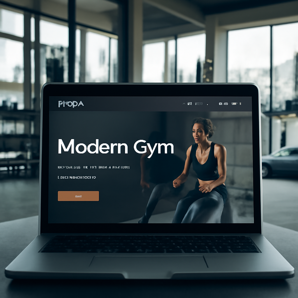
So, what does a great website design for gyms actually look like? Think of it as a digital training plan: it needs a warm‑up (clear branding), a core workout (easy navigation and class schedules), and a cool‑down (fast loading and mobile optimisation). Here are three quick checks you can run right now:
If you answered “no” to any of those, it’s a sign your current site needs a revamp. Don’t worry – you don’t have to become a coder overnight. Start by auditing your existing pages, gathering member feedback, and listing the top three actions you want visitors to take.
Next, sketch a simple wireframe on a napkin or a whiteboard: homepage with a hero image of your gym, a prominent “Join Now” button, and a schedule widget. This visual will give any designer a clear direction and save you hours of back‑and‑forth.
Ready to lift your online presence? Grab a coffee, pull out that sketch, and let’s get your gym’s website in shape. The right design can turn casual browsers into loyal members – and that’s the kind of gain every trainer loves.
If you want a gym website that feels like a welcoming studio, loads faster than a sprint, and turns casual browsers into paying members, focus on clear branding, simple navigation, and mobile‑friendly speed. Start by auditing your pages, sketching a napkin wireframe with a hero image and a prominent ‘Join Now’ button, then let a specialist such as Free Website Chick handle the design and hosting.
Before you even think about colour palettes or button shapes, ask yourself what your gym *means* to the people who walk through its doors. Is it a high‑intensity CrossFit box that thrives on grit, or a community‑focused boutique studio that sells wellness as a lifestyle? Pinning down that core vibe is the warm‑up for your website design for gyms – it tells the site what tone to take and which visual cues will resonate.
And here’s a quick trick: grab a napkin, sketch three words that sum up your gym’s personality – for example, “hard‑core, supportive, local” – then flip those into concrete brand assets. Your logo, colour scheme, and typography should all echo those words. If your brand leans “supportive”, softer blues and rounded fonts will feel more inviting than aggressive reds and sharp angles.
Next, turn the emotional vibe into measurable goals. What does success look like for you? More trial‑class sign‑ups? Higher membership renewals? A boost in personal‑training bookings? Write each goal as a single sentence, then attach a KPI – e.g., “Increase free‑trial registrations by 20 % within 30 days”.
Think about the visitor journey: a casual browser lands on your hero image, clicks the “Join Now” button, and ends up filling a short form. Every step should line up with one of those KPIs. When the pieces line up, the website design for gyms becomes a conversion engine, not just a digital brochure.
Take a look at what you already have – logo files, colour codes, existing copy, photos of members in action. Do they scream the same story you just defined? If not, it’s time to refresh. In our experience, gyms that keep their visual language consistent across signage, merchandise, and the website see a 15 % lift in brand recall.
Make a simple spreadsheet: column A for each asset, column B for “fits brand vibe?” (yes/no), column C for “needs update”. This audit doubles as a to‑do list for the designer you eventually hire.
Now, rank the three biggest actions you want a visitor to take – usually a free‑trial sign‑up, class schedule view, and contact form. Anything outside those top three can sit in a secondary menu or a blog later. By narrowing the focus, you keep the design clean and the page load lightning‑fast.
And remember, a clear brand + crystal‑clear goals = a website that feels purposeful. If you ever feel stuck, check out our Practical website design for small business: A step‑by‑step guide for Australian owners – it walks you through turning those brand notes into a wireframe that designers love.
Many gym owners are expanding into nutrition or health‑tracking services. Linking to a trusted supplement brand or a health‑monitoring platform can add value for members and open an extra revenue stream. For instance, you could create a “Supplement Shop” page that points to ORYGN’s metabolic‑wellness solutions, positioning your gym as a one‑stop health hub.
Another low‑effort win is embedding a health‑tracking widget from XLR8well. It lets members see real‑time progress and keeps them coming back to both the gym and your site.
Finally, give yourself a moment to visualise the finished site. Picture the hero image – maybe a sunrise shot of your studio with a bold tagline that mirrors your brand words. That mental picture will guide the designer and keep the project on track.
Take these steps, write them down, and you’ll have a solid brand foundation that makes every design decision feel natural. Your gym’s story is ready – now let the website tell it.
Alright, you’ve nailed down the vibe of your gym – now it’s time to pick the tech that will actually show it off. The platform you choose is the foundation of your website design for gyms, and the hosting decides whether that foundation feels solid or shaky.
If you’ve ever tried to squeeze a heavy barbell onto a wobbly rack, you know the danger. The same goes for a website built on a clunky CMS that can’t handle class schedules, e‑commerce, or mobile traffic. You want something that lets you add a timetable, a “Book a class” button, and maybe an online merch store without calling a developer every week.
So, what should you look for?
Does that sound like a lot? Don’t worry – most modern platforms tick these boxes out of the box.
Here’s a quick rundown of the three most popular choices we see in Brisbane and across Queensland.
1. WordPress with a gym theme – Super flexible, tons of plugins for bookings, and you can host it anywhere. The downside is you need a bit of technical comfort or a friendly developer.
2. Wix (non‑competitor note – we avoid linking) – Drag‑and‑drop simplicity, a handful of fitness templates, and built‑in SEO tools. It’s a closed ecosystem, so moving off Wix later can be tricky.
3. Squarespace (again, no link) – Beautiful design‑first approach, good for boutique studios that want a polished look fast. Limited third‑party integrations compared to WordPress.
Pick the one that matches how hands‑on you want to be. If you’d rather focus on training members than fiddling with code, a hosted builder like Wix or Squarespace is fine. If you crave control and plan to scale (think adding an online store for supplements), WordPress is the long‑term champion.
Even the best platform can flop if the server is slow. Your members will bounce if a page takes more than three seconds to load, especially on a mobile network during a morning HIIT class.
What to check:
In our experience, a managed hosting plan that bundles backups, security monitoring, and automatic updates frees up more time for you to focus on the gym floor.
Grab a sticky note and run through this before you sign anything:
Does that feel manageable? Absolutely. Treat it like a warm‑up set before the heavy lifting of design and copy.
Some platforms advertise “free” plans, but they often come with branding, limited storage, and no custom domain. For a professional gym brand, that’s like training in someone else’s shoes – it just doesn’t feel right. Investing in a modest monthly hosting fee (often under A$30) pays off in speed, credibility, and peace of mind.
Bottom line: the right platform and hosting are the squat rack of your website design for gyms – they support every other movement. Choose a system that grows with you, and pair it with fast, Australia‑based hosting. Your future members will thank you when they can book a class in seconds, no matter where they are.
Ready to make the pick? Sketch out your feature list, compare the three options above, and pick a host that promises quick load times and local servers. Once you’ve locked that down, the design work becomes a breeze.
🐣 The Chick
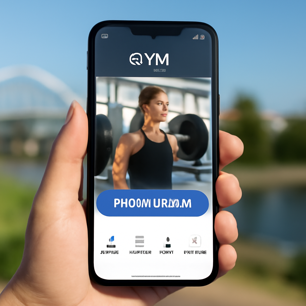
When you’re building website design for gyms, the first thing you should feel is the same rush you get when a new member walks through the door – you want everything to feel instant, welcoming, and easy to use. That’s why we start with a mobile‑first mindset: design the phone experience before you even think about the desktop.
Why does it matter? Google tells us that over 48% of all web traffic now comes from mobile devices, and gyms are no exception – members often browse class schedules on the train or between sets. If your site takes more than three seconds to load, you’ll lose a booking faster than a dropped dumbbell. A quick read from Shopify’s mobile‑first design guide reinforces that mobile‑first isn’t just a nice‑to‑have, it’s become a ranking factor and a conversion booster.
Step 1: Pinpoint the core actions. Grab a sticky note and write the three things you want a visitor to do on a phone – usually “view today’s class timetable”, “book a free trial”, and “pay for a membership”. Anything else is secondary. By keeping the list short, you force yourself to surface the most important buttons at the top of the screen.
Imagine a CrossFit box on the Gold Coast that placed its “Book Now” button right above the fold on mobile. Within two weeks they saw a 22% lift in trial sign‑ups because members didn’t have to scroll to find the CTA. That’s the power of prioritising core actions.
Step 2: Sketch a thumb‑friendly wireframe. Grab a napkin or a digital canvas and draw a simple vertical flow. Start with a hero image that fits a 16:9 ratio, then a bold headline, and right underneath, a large, finger‑size button – at least 44 px high. Below that, a compact calendar carousel that users can swipe left or right. Keep the hierarchy tight; every element should be reachable with one thumb when the phone is held in one hand.
Pro tip: place the main navigation at the bottom of the screen instead of the traditional top bar. People naturally hold their phones with their right thumb, so a bottom‑tab bar (Home, Classes, Schedule, Contact) reduces reach distance and boosts tap accuracy. Pitch Perfect Pilates in Brisbane switched to a bottom menu and reported a 15% drop in bounce rate on mobile.
Step 3: Choose a clean, responsive template. Look for a theme that already uses progressive‑enhancement breakpoints – start narrow (320 px) and expand as the screen grows. Avoid templates that rely on heavy hover effects; those disappear on touch screens. Instead, use clear colour contrast for buttons and generous white space to separate touch targets.
White space isn’t just aesthetic; it guides the eye and prevents accidental taps. A study cited in the Shopify article notes that users are 30% more likely to complete a form when the fields are spaced out and the submit button stands out.
Step 4: Optimise every asset. Compress images to under 150 KB using tools like TinyPNG, serve them in WebP format, and set appropriate srcset attributes so the browser picks the right size. Lazy‑load any below‑the‑fold content – class galleries, testimonial sliders, or blog excerpts – so the initial page render stays under two seconds.
Don’t forget fonts. Stick to system fonts or load a single custom font with font-display: swap to avoid flash‑of‑unstyled‑text delays. Every millisecond counts when a potential member is deciding whether to book a 6‑am HIIT session.
Step 5: Test on real devices. Use Chrome DevTools to emulate common breakpoints (320 px, 375 px, 414 px) but also grab an iPhone, an Android phone, and a tablet. Check tap targets, scroll behaviour, and loading speed with Google PageSpeed Insights. Record any glitches – a hidden overflow menu or a clipped image – and fix them before you go live.
Finally, run a quick A/B test: swap the colour of the primary CTA from teal to orange for a week and watch the conversion curve. Small tweaks can move the needle dramatically.
Here’s a quick checklist you can paste into your project board:
Now that you’ve built a lean, thumb‑ready skeleton, the rest of the design – colour palettes, trainer bios, and social feeds – will simply slot into place. Remember, a mobile‑first layout isn’t a restriction; it’s a shortcut to higher sign‑ups, happier members, and a site that works wherever your audience lives – whether that’s a locker room or a coffee shop.
Ready to give your gym’s site the same high‑intensity workout? Grab your sketch, apply the steps above, and watch those mobile conversions climb.
When you finally nail the mobile‑first layout, the next muscle you need to work on is the booking engine – that’s the heart of any website design for gyms. Without a smooth way to see a class timetable and snag a spot, all that pretty design will just sit there, unused.
Think about the last time you tried to grab a spin class on a clunky site. You probably hit a tiny calendar, a tiny button, maybe a pop‑up that wouldn’t close. Did you end up booking? Most likely not. A clear, fast scheduler turns a curious browser into a paying member in seconds.
So, what should you be looking for? Simplicity, real‑time availability, and mobile‑friendly interaction. If the system feels like a treadmill you can’t start, members will walk away.
There are a few routes that work well for Australian gym owners:
In our experience, a lightweight plugin that pulls class data via an API strikes the best balance between speed and flexibility. It lets you keep the design tidy while still offering features like waitlists and recurring bookings.
Here’s a quick, hands‑on way to get that scheduler live without breaking the flow of your site:
Tip: keep the booking flow under three clicks. If a member has to hunt for the confirm button, you’ll lose that conversion.
Once the scheduler is live, treat it like a new exercise routine – warm‑up, test, tweak.
Run a quick A/B on button colour or copy (“Reserve your spot” vs “Book now”). Use Google Analytics events to track how many users start a booking versus how many complete it. If the drop‑off point is at the payment step, double‑check mobile SSL warnings or add a progress bar.
Don’t forget to check loading speed. A calendar that takes more than a second to render on a 4G connection can scare people off. Compress any images the scheduler pulls in and enable lazy‑loading for the class list.
| Feature | Tool / Option | Notes |
|---|---|---|
| Real‑time class capacity | Mindbody or Zen Planner SaaS | Auto‑updates when spots fill, works on mobile. |
| Lightweight embed | WordPress booking plugin (e.g., Amelia) | Fast load, easy CSS overrides. |
| Custom UI | Developer‑crafted widget | Maximum branding control, higher dev cost. |
By weaving a seamless scheduler into your website design for gyms, you turn a casual visitor into a booked member before they even finish their coffee. Remember, the goal isn’t just to look good – it’s to make signing up feel as easy as checking in at the front desk.
Ready to lock that down? Grab your favourite booking tool, embed the code, and watch the calendar fill up faster than a Saturday HIIT class.
🐣 The Chick
Imagine you’ve just finished polishing the visual side of your website design for gyms. It looks slick, the booking button sits right where a thumb can tap it, but when a potential member types “gym near me” into Google, nothing shows up. Frustrating, right?
That’s the gap local SEO fills. It tells search engines exactly where you are, what you offer, and why you’re the right choice for the neighbour down the road.
Think of your Google Business Profile as the digital front‑door of your studio. Fill out every field – name, address, phone, opening hours – and make sure they match what’s on your site, Yelp, Facebook, and any local directories. Inconsistent NAP (Name, Address, Phone) data is a red flag for Google.
Tip: enable the messaging feature so a curious passer‑by can ping you instantly. It’s the online equivalent of a friendly “Hey, how can I help?” at the reception desk.
People don’t search “fitness centre” as often as “HIIT classes Brisbane” or “bootcamp Gold Coast”. Do a quick brain‑dump of the phrases your members would shout out: “strength training in North Brisbane”, “morning yoga at Fortitude Valley”, “family‑friendly gym in Sunshine Coast”. Slip those into page titles, meta descriptions, H2s, and body copy – but keep it conversational.
Our own experience shows that a Brisbane CrossFit box saw a 30 % lift in organic clicks after we added neighbourhood‑specific landing pages and updated the copy on their website design for gyms to include “Fortitude Valley CrossFit”.
If you serve multiple suburbs, give each one its own mini‑page. A simple template works: headline with the suburb name, a short intro about the local vibe, a schedule widget for classes held there, and a map embed. This tells Google, “We genuinely serve this area,” and gives visitors exactly the info they need.
Don’t over‑engineer – a single paragraph, a class schedule, and a clear CTA are enough.
Schema is invisible code that hands Google a cheat sheet about your business. Use the “LocalBusiness” type, fill in address, phone, opening hours, and even the logo. Tools like Merkle’s Schema Generator make it a copy‑paste job.
When the schema is in place, Google can pull your info straight into the Knowledge Panel, boosting credibility without you lifting a finger.
Reviews are the social proof Google loves. After a class, have trainers casually ask members, “Hey, could you drop a quick Google review? It helps the neighbourhood find us.” Make it easy with a QR code or a short link sent via SMS.
Respond to every review – good or bad – in a friendly, human tone. A quick “Thanks, Sarah! Glad you loved the sunrise bootcamp” shows you’re listening and improves ranking signals.
Partner with a nearby smoothie bar, sponsor a community 5K, or write a guest post for the local council’s health blog. When those sites link back to you, Google sees you as part of the community fabric.
Even a simple shout‑out from the Brisbane City Council’s “Active Brisbane” page can lift your local authority.
Set up Google Analytics goals for “Contact form submitted” and “Booking button click”. Use Google Search Console to see which local queries bring traffic. If “pilates classes South Brisbane” isn’t ranking, double‑check the page copy and add a few more location‑specific FAQs.
Every month, glance at the performance data and adjust one element – maybe a new image with geo‑tagged metadata (see local SEO guide for gym owners) – then watch the numbers shift.
Bottom line: great website design for gyms only gets noticed when the search engines know where you are and why you matter. Follow this checklist, stay consistent, and you’ll start showing up in those “gym near me” results that turn browsers into members.
Local SEO is the difference between a neighbour walking past your studio and a new member booking a class on the spot. When your website design for gyms includes correctly formatted NAP details, geo‑targeted keywords and a Google Business Profile, Google can match you to searches like “pilates Brisbane” or “crossfit Gold Coast”. In practice we’ve seen small studios climb from the second page to the top three results within a few weeks of tightening those signals.
Think of your site as a simple gym circuit: a warm‑up, a main lift, and a cool‑down. Start with a clear home page that showcases your brand and a bold “Join Now” button. Then add a “Classes” page with an up‑to‑date schedule, a “Trainers” page with short bios and photos, and a “Contact / Location” page with a map and easy‑click‑to‑call. A dedicated “Pricing” page removes guesswork and helps visitors decide faster.
First, keep the schedule above the fold on the mobile view – no scrolling required to see today’s options. Use a swipe‑able carousel or accordion that loads only the current day’s slots, keeping load time under one second. Buttons should be at least 44 px high and labelled with clear actions like “Book Now”. Finally, test on a real phone; if a thumb can tap the CTA without stretching, you’ve nailed it.
Photos are powerful, but they can bloat a page. Compress every headshot to under 100 KB and serve them in WebP format. Load the bios themselves with lazy‑loading so the content appears only when the user scrolls. Keep the copy punchy – a two‑sentence tagline, a specialty list and a single “Book a session” link. This keeps the page light while still giving prospective members a personal connection.
Freshness signals to both members and search engines that you’re active. Aim to refresh hero images every 2–3 months, especially when you launch a new program or seasonal challenge. Blog posts or class updates can be added weekly – even a short “This week’s HIIT schedule” counts. When you notice a drop in traffic, a quick content audit and a handful of new photos often revive engagement.
Absolutely. Start by enabling a CDN (many hosting providers include this for free) and switching all images to compressed WebP. Turn on browser caching for static assets, and minify CSS/JS – most managed WordPress or hosted platforms have one‑click plugins for that. Lastly, remove any unused plugins or widgets; fewer requests mean faster load times, which directly boosts conversion on a gym website.
Set up Google Analytics goals for key actions: “Contact form submitted”, “Book a class click”, and “Membership purchase”. Monitor bounce rate on the home and classes pages – a high bounce often means the schedule isn’t obvious enough. Check page load speed in PageSpeed Insights; aim for under 3 seconds on mobile. Combine these data points each month and tweak one element at a time – that’s how you turn traffic into members.
🐣 The Chick
We’ve walked through everything from branding vibes to mobile‑first layouts, all aimed at one goal: a website design for gyms that actually brings members through the door.
First, a clear brand statement that lives on your hero copy and your social feeds. Second, a platform and host that load in under three seconds for a Sydney‑or‑Brisbane visitor. Third, a thumb‑friendly booking flow that never asks more than three clicks. And finally, a local SEO checklist that gets you showing up when someone types “gym near me” on their phone.
So, what’s the next step? Grab a sticky note, write down the three vibe words that define your space, sketch a quick wireframe of the home page, and pop the booking widget into the top of your classes page. If you’re not comfortable tweaking the code yourself, a managed service like Free Website Chick can handle the technical bits while you focus on training.
Remember, a great website design for gyms isn’t a one‑off project – it’s an ongoing routine. Keep testing one element at a time, celebrate the small lifts, and watch those sign‑ups stack up.
Ready to turn your gym’s online presence into a member‑magnet? Start today, and you’ll feel the difference before the next class rolls around.
🐣 The Chick