Picture this: you’ve just stocked the shelves of your Brisbane boutique, the arvo sun is shining, and you’re ready to sell online, but the website looks like a digital ghost town.
That feeling of “my site should be pulling in customers, not scaring them away” is all too common for small business owners across Queensland. In ecommerce website design, the layout, navigation and visual cues are the shopfront that shoppers can’t walk past.
So, what’s the first step? Stop treating your site like a static brochure and start thinking of it as a 24/7 sales assistant. It needs to greet visitors, showcase products clearly, and guide them to checkout without a hiccup.
What we’ve seen work best is a clean, mobile‑first design that loads in under three seconds. Australians are on the go, and if your pages lag, you’ll lose sales faster than a chicken can cross the road.
A good colour palette that reflects your brand, legible fonts, and high‑resolution images of your products create trust. Pair that with clear call‑to‑actions – like “Add to Cart” that pops in a friendly green – and you’re already speaking the language of conversion.
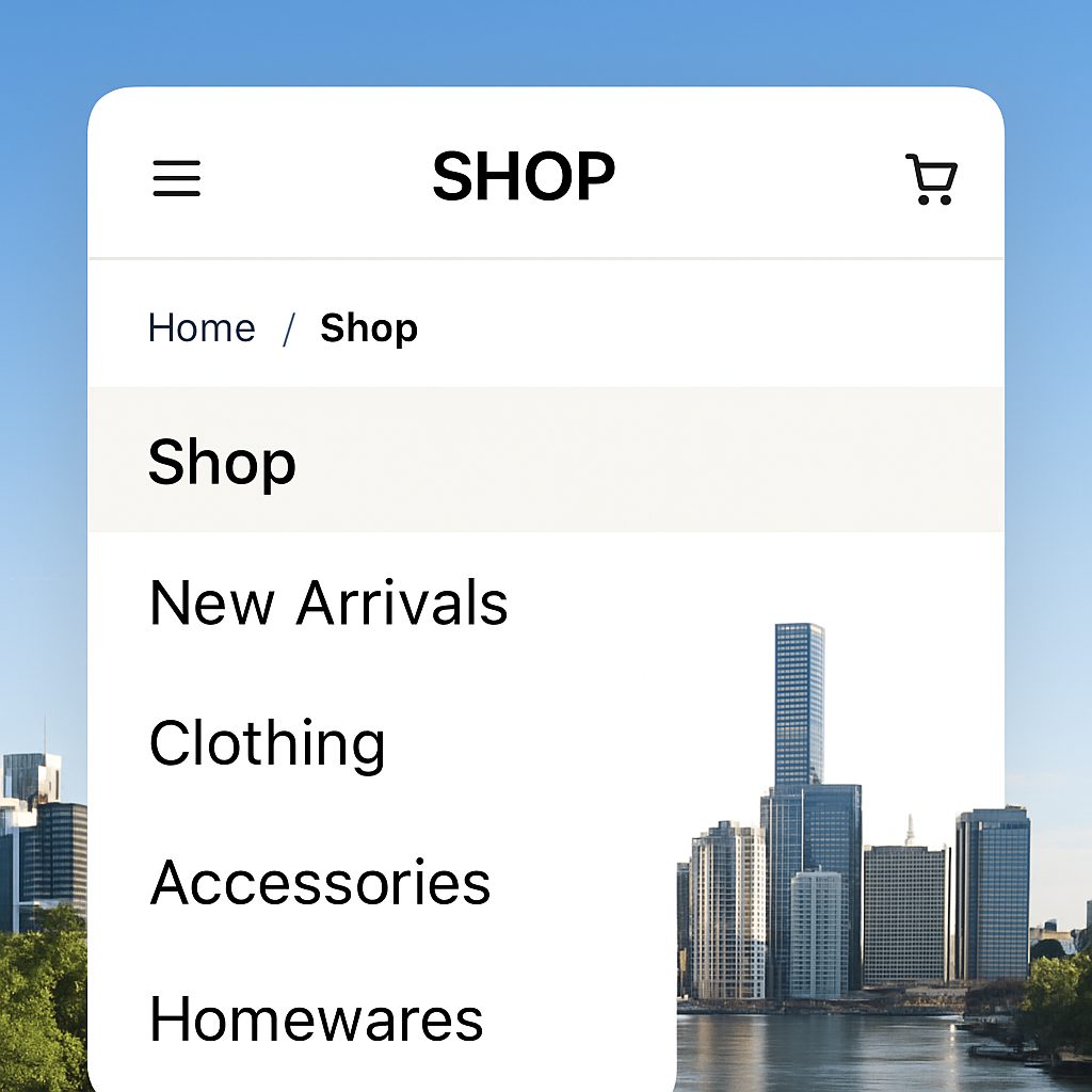
But design isn’t just about looks. It’s about structure. Logical categories, breadcrumb trails, and a search bar that actually returns relevant results keep shoppers from getting lost. Think of it as organising aisles in a physical store; the easier the navigation, the longer they’ll stay.
In our experience at Free Website Chick, we help local entrepreneurs turn a messy draft into a polished storefront that feels as welcoming as a neighbourhood cafe. We handle everything from the initial wireframe to ongoing hosting, so you can focus on sourcing stock, not troubleshooting code.
Ready to give your online shop the makeover it deserves? Let’s start with a quick audit of your current design – you’ll be surprised how a few tweaks can boost sales dramatically.
🐣 The Chick
Punchy advice, no fluff, and occasional chicken puns.
If you’re a Brisbane‑based entrepreneur wrestling with slow load times, confusing navigation, or bland branding, our quick‑fire guide to ecommerce website design shows how a few smart tweaks can turn browsers into buyers. In just a handful of minutes you’ll learn which colour palettes, button styles and site structures matter most, so you can launch a site that feels as welcoming as your local café and starts driving sales today.
Before you start fiddling with colour palettes or button shapes, you need to know what you actually want your store to achieve. Are you chasing more foot traffic to your brick‑and‑mortar shop in Brisbane, or is the aim to boost online repeat purchases from customers across Queensland?
It feels a bit like planning a road trip – you wouldn’t set off without a destination, right? So, let’s pin down the goals that will guide every design decision you make.
Think of goals as measurable milestones. Typical e‑commerce objectives include:
Write them down as specific, time‑bound statements – for example, “Boost monthly revenue by A$5,000 by September.” When the goals are clear, the design can be purpose‑built to hit them. Our ecommerce website design services always start with this kind of goal‑mapping session.

Now picture the person who will actually click “Add to Cart.” Are they busy mums in the Sunshine Coast juggling school runs, or are they young professionals in Fortitude Valley hunting the latest streetwear? Demographic details matter, but so do psychographic cues – what keeps them up at night, what values they cherish, and how they like to shop.
Try answering these quick prompts:
When you can visualise “Jenny the yoga teacher” or “Mark the IT contractor,” the site’s tone, imagery, and navigation flow start to feel natural rather than generic.
Take your goal list and audience sketch and ask yourself: which design elements will push each goal forward for this audience? For a mobile‑first crowd, a sticky “Buy Now” button in a bright green shade can shave seconds off the checkout path – a simple tweak that directly supports a lower cart‑abandonment target.
For a brand that prides itself on sustainability, showcase that story on the homepage with high‑resolution images of recycled packaging. It builds trust with eco‑conscious shoppers and helps hit the repeat‑purchase metric.
Once the blueprint is set, the next step is to feed it into your SEO and backlink strategy. A solid goal‑driven site pairs perfectly with an automated content engine that can create niche‑specific blog posts and earn quality links. That’s where tools like Rebelgrowth’s SEO platform come into play – they help you amplify the visibility of the pages you’ve built.
Don’t forget the power of branded merchandise to reinforce your audience’s connection. A custom water bottle with your logo, for instance, can turn a one‑time buyer into a walking ambassador. Companies such as Quench Bottles specialise in low‑minimum, on‑demand drinkware that fits perfectly into a small‑business promotional strategy.
To wrap up this step, draft a simple one‑page brief that lists your top three goals, a short audience persona, and the key design tactics you’ll use to bridge the two. Keep it visible on your desk or pinned in your project board – it will be the north star as you move through the rest of the ecommerce website design process.
Now that you’ve nailed down what you want to achieve, the next big decision is the foundation that will hold everything together – the ecommerce platform and its hosting.
Think of it like picking the right kitchen for your restaurant. A cramped, leaky space will slow you down, while a well‑equipped kitchen lets you focus on the food.
So, which platform gives you the tools you need without turning the build into a nightmare?
First, ask yourself: does the platform support the kind of products you sell? A boutique clothing line needs colour swatches and size guides, whereas a wholesale distributor might need bulk‑order pricing tables.
Next, check the payment options. Australian shoppers expect credit cards, PayPal, and increasingly Buy‑Now‑Pay‑Later services like Afterpay. If the platform only offers one gateway, you’ll be leaving money on the table.
Finally, consider scalability. A site that handles 50 orders a day will choke at 500 if the underlying architecture isn’t built for growth.
Even the flashiest platform can sputter if the hosting isn’t up to the task. Look for a host that promises at least 99.9% uptime, built‑in SSL certificates, and automatic backups.
Speed matters more than ever down under, where mobile users dominate. A one‑second delay can shave up to 7% off conversion rates, according to a 2023 Australian digital commerce study.
That’s why a local data centre – ideally in Brisbane or Sydney – can give you that extra millisecond boost.
When you’ve ticked every box, you’ll have a clear picture of which platform fits your business like a glove.
Take Jess, who runs a handmade jewellery shop in Fortitude Valley. She started on a generic free builder, but the checkout didn’t accept split‑payments, and the site crashed during a weekend market promotion. After switching to a platform that offers integrated Afterpay and Australian‑based hosting, her cart abandonment dropped from 62% to 38% within a month.
Then there’s Sam, a wholesale surfboard supplier on the Gold Coast. He needed bulk‑order pricing tables and a CSV import tool for 200‑plus SKUs. The platform he chose let him upload his entire catalogue in one go and automatically calculate tiered discounts. Within six weeks his average order value rose by 22% because retailers could order larger packs more easily.
Both stories show that the right platform isn’t just a technical choice – it’s a growth lever.
• Keep the admin panel tidy. If you spend more than five minutes finding the “add‑product” button, you’ll waste hours later.
• Use a staging environment. Test every new app or theme update before it goes live – it saves you from midnight panic.
• Don’t forget SEO basics. A platform that auto‑generates clean URLs, lets you edit meta titles, and builds an XML sitemap will keep your ecommerce website design visible to Aussie shoppers.
• Factor in support. When something goes wrong at 2 am, a 24/7 live chat or local phone line is worth its weight in gold.
By following these steps, you’ll choose a platform and hosting combo that lets your design shine, your checkout flow stay smooth, and your business keep growing.

When you stare at a messy menu and wonder why shoppers bounce, you’re feeling the exact frustration most Brisbane owners face – the site looks like a maze. Good ecommerce website design starts with a navigation system that feels as natural as a stroll down Queen Street Mall.
First thing’s first: draw a quick hierarchy on a napkin. What are your top‑level categories? Do you need “Women’s”, “Men’s”, “Kids”, or perhaps “Bulk‑Buy” for wholesale clients? Keep it to five or six main buckets – anything more and you’ll start to see the overwhelm that Baymard research flags as a common pitfall.
Take each top‑level bucket and break it down into sub‑categories that still make sense at a glance. The rule of thumb? No more than ten items per level. If you run a boutique surf shop in the Gold Coast, you might have “Boards”, “Wetsuits”, “Accessories”. Under “Boards”, limit sub‑options to things like “Shortboards”, “Longboards”, “Kids Boards”. This keeps the drop‑down tidy and prevents shoppers from feeling lost.
And remember: on mobile the menu is the gateway. Use clear, descriptive labels – instead of just “New”, say “New Arrivals – Women’s”. Baymard found that fully‑scoped links on mobile homepages help users retain an overview of where they are.
Too many links equals decision fatigue. When you see a menu that looks like a grocery list, you’ll probably click away. Trim any category that doesn’t drive at least ten products or that overlaps with another. If you sell both “Beach Towels” and “Surf Towels”, consider merging them under a single “Towels” heading.
Hover‑based drop‑downs work well on desktop, but they need a short delay – about 300‑500 ms – so the menu doesn’t flicker every time the cursor skims past it. That tiny adjustment can keep a user from accidentally opening the wrong submenu and leaving the page.
Ever landed on a product page and wondered, “Where am I in the site?” If the main navigation doesn’t show the active category, users lose their bearings. A simple colour change or bold style on the active top‑level link tells shoppers, “You’re here.” Baymard notes that 95 % of sites fail to highlight the current scope, so you have a big opportunity to stand out.
Breadcrumbs are your best friend too. Place them just under the header so a visitor can instantly backtrack to “Home > Boards > Shortboards”. It’s a tiny UI cue that packs a big conversion boost.
Australia’s shoppers are on the move. A menu that works on a desktop but collapses into a tiny hamburger on a phone will kill your conversion rate. Run a quick test: open your site on an iPhone or Android, tap each menu item, and make sure the tap target is at least 44 px tall. If a user has to pinch‑zoom to hit a link, they’ll bail.
Check the tap‑through rate with Google PageSpeed Insights – the “Accessibility” score will flag any touch‑target issues. Fixing those can shave seconds off the user journey, which, as we’ve seen, can lift sales.
Here’s a quick checklist to run before you call the site live:
Implementing these steps gives your ecommerce website design a navigation backbone that feels intuitive, whether a customer is browsing from a Brisbane café or a Gold Coast beach. The result? Less friction, more clicks, and a smoother path to checkout.
And if you ever feel stuck, the Baymard Institute research on navigation best practices offers a deep dive into the exact numbers behind these recommendations.
Remember, a tidy menu is like a well‑organised shop aisle – it lets shoppers find what they need without wandering into the wrong section.
Ready to give your visitors a clear path? Start by sketching that hierarchy, trim the excess, and watch the checkout flow smooth out.
Ever opened a site on your phone and felt like you were squinting through a microscope? That moment of frustration is exactly why mobile optimisation sits at the heart of any solid ecommerce website design.
We’ve already tidied up the menu, so now let’s make sure the checkout doesn’t feel like a maze. A smooth, friction‑free flow can be the difference between a cart abandoned at 68% and a completed purchase.
Australian shoppers spend over 70% of their online time on smartphones. A one‑second delay in page load can shave up to 7% off conversion – that’s not a myth, it’s data from local market studies.
So, if your checkout takes longer than a coffee break, you’re losing sales.
Does that feel like a lot? Pick three items to implement this week, then iterate.
Jess, who runs a boutique jewellery shop in Fortitude Valley, switched from a five‑step checkout to a three‑step “quick buy” layout. Within three weeks her mobile conversion jumped from 2.8% to 5.1% – a 82% lift.
On the Gold Coast, a surf‑gear wholesaler added Apple Pay and Google Pay as one‑tap options. Because the payment step shrank from 30 seconds to under 10, cart abandonment fell from 62% to 38% during the peak summer sale.
Both cases prove that tiny tweaks in the checkout flow can create massive revenue ripples.
First, strip away any non‑essential fields. Ask only for what you need to fulfil the order – name, email, shipping address, and payment details. Anything extra is an excuse for the shopper to bail.
Second, use clear, friendly copy. Instead of “Enter your billing information”, try “Tell us where to send your goodies”. It sounds less formal and more like a chat with a mate.
Third, keep the design consistent with the rest of your ecommerce website design – same button colour, same font, same spacing. Consistency builds trust.
Compress product images to under 150 KB for mobile. Serve them via a CDN (many Australian hosts include this). Lazy‑load images that sit below the fold, so the page renders instantly.
Enable browser caching for static assets – that way repeat visitors won’t wait for the same files to download again.
Finally, run a quick “mobile test” in Chrome DevTools: look for “Slow Network” and see which resources are holding up the checkout.
| Feature | Tool/Option | Quick Win Note |
|---|---|---|
| Tap‑target size | CSS min‑height 44 px | Fixes accidental taps on small buttons |
| One‑click payments | Apple Pay / Google Pay integration | Cuts checkout time by ~20 seconds |
| Progress bar | Simple HTML/CSS step indicator | Reduces perceived effort, lowers abandonment |
Got all that? Great. The next step is to test, measure, and tweak. Open your site on a few devices, add a product to the cart, and walk through each step. Note any moments where you hesitate – that’s a clue for improvement.
Remember, every extra second you shave off the mobile checkout is a potential sale saved. Keep the experience as breezy as a Brisbane arvo sea‑breeze, and watch your conversion numbers rise.
🐣 The Chick
Punchy advice, no fluff, and occasional chicken puns.
Now that your checkout is humming, it’s time to make sure Google can find you, hackers stay out, and you actually know what’s working. In other words, this is where ecommerce website design meets the three‑pillars of a thriving online shop.
Feeling a little overwhelmed? Don’t worry – we’ll break it down into bite‑size actions you can roll out this week.
First thing’s first: if Google can’t crawl your pages, you won’t get any organic traffic, no matter how pretty your design is. Here’s a quick audit you can run:
/handmade‑necklace) and avoid unnecessary parameters.Got a blog? Throw in a few internal links to your product pages. It tells search engines those pages are important and helps visitors discover more of your catalogue.
Security isn’t a nice‑to‑have; it’s a must‑have for any ecommerce website design that handles payments. A single breach can erase months of hard‑won trust.
Start with the basics:
If you accept credit‑card data directly, you’ll need PCI‑DSS compliance. The easiest route for small Aussie businesses is to rely on a hosted payment gateway (PayPal, Afterpay, Stripe) that handles the heavy lifting.
All the design and security work in the world won’t help you grow unless you can see what’s actually moving the needle.
Here’s a lean analytics stack you can get running in under an hour:
Once the data is flowing, schedule a weekly 15‑minute review. Look for any sudden spikes in bounce rate or a dip in conversion – those are your early warning signs.
So, what’s the next move? Pick one item from each of the three buckets (SEO, security, analytics) and tick it off today. Small, consistent wins add up to a solid, trustworthy ecommerce website design that not only looks good but also gets found, stays safe, and keeps you in the driver’s seat of your numbers.
🐣 The Chick
Punchy advice, no fluff, and occasional chicken puns.
You’ve made it to the end of our deep‑dive into ecommerce website design, and if you’re feeling a mix of excitement and “where do I start?” you’re in good company.
The truth is, great design isn’t a one‑off project; it’s a habit of picking one tiny tweak each week and watching the numbers inch up.
Remember the three buckets we’ve been juggling – clean navigation, mobile‑first checkout, and the SEO‑security‑analytics trio – they’re the levers that keep your shop humming.
So, what’s the next move? Grab a sticky note, write down one item from each bucket, and set a calendar reminder for tomorrow. Maybe it’s tightening your button tap‑targets, adding a breadcrumb trail, or firing up GA4 goals.
When you test that change, keep an eye on the data you just set up – a dip in bounce rate or a bump in add‑to‑cart tells you you’re on the right track.
If you ever hit a wall, know that we’ve helped dozens of Brisbane‑based entrepreneurs untangle the same knots, and a quick chat can save you hours of guesswork.
Bottom line: ecommerce website design is a steady series of small wins, not a massive overhaul. Keep it simple, stay curious, and let the metrics guide you.
🐣 The Chick
Punchy advice, no fluff, and occasional chicken puns.
Start by writing down a crystal‑clear goal – are you after more repeat orders, a bigger email list, or lower cart abandonment? That tiny sentence becomes the north star for every layout, colour, and button you choose. It doesn’t need a fancy template yet; just a sticky note, a coffee, and a quick sketch of the ideal customer journey.
Think of navigation like a shop aisle – it gets messy as you add new products. A quick audit every 4‑6 weeks keeps it tidy. Pull up your top‑traffic pages in Google Analytics, spot any drop‑offs, and ask yourself whether a visitor can reach a product in three clicks or fewer. If the answer is “maybe not”, trim or regroup the menu.
First, make every tap target at least 44 px tall – no more pinching with a thumbnail. Next, ditch long‑form checkout forms; use auto‑fill for address fields via the Google Places API. Finally, add a progress bar so shoppers see “Step 2 of 3”. Those three tweaks alone can shave seconds off load time and push conversion up by 10‑15 %.
Absolutely. SEO is the road that brings shoppers to your door; without clean titles, meta descriptions, and a sitemap, Google won’t know you exist. Security – a simple HTTPS badge and regular updates – stops hackers from stealing payment data and eroding trust. And analytics give you the hard numbers to prove which design tweaks actually move the needle.
Set up a A/B test where 50 % of visitors see the old version and 50 % see the new one. Track the same metric you care about – add‑to‑cart rate, checkout completion, or bounce rate – for at least one week to smooth out daily traffic spikes. If the new version outperforms by a statistically significant margin, roll it out site‑wide.
For a small boutique, you can expect anywhere from A$3,000 to A$7,500 for a custom design, hosting, and basic SEO setup. If you need more complex features – like bulk‑order pricing tables or multi‑currency support – budget closer to A$10,000. Remember, a well‑built site saves you time and lost sales, so treat it as a long‑term investment.
If you’re spending more time troubleshooting server errors than creating products, it’s time to hand the tech over. Managed hosting gives you automatic backups, 24/7 support, and a local Australian data centre that keeps page‑load times razor‑sharp. For busy Brisbane entrepreneurs who want to focus on stock and customers, that peace of mind pays for itself.
🐣 The Chick
Punchy advice, no fluff, and occasional chicken puns.