Ever stared at a blank screen, wondering why your online shop feels more like a digital dead‑end than a bustling storefront?
If you’re a small business owner juggling invoices, inventory, and maybe a few sleepless nights, that frustration is totally normal.
What we’ve seen work best is a website design for small business that talks the same language you use with your customers – clear, friendly, and dead‑simple to navigate.
Picture this: a local café owner who just added a new brunch menu. With a few well‑placed images, a colour palette that mirrors the shop’s walls, and a “book a table” button that’s impossible to miss, customers can click, reserve, and walk in feeling like they’re already part of the community.
So, why does that matter? Because every extra click, every confusing label, is a chance the visitor walks away – and for a small operation, that loss adds up fast.
A good design also keeps you out of the tech‑support nightmare. When the site loads in a flash on a phone, when the checkout form remembers a returning customer’s details, you spend less time fixing bugs and more time serving real people.
And here’s a tiny secret most DIY platforms ignore: consistency across every page builds trust faster than any tagline.
That’s why we always start with a quick audit – look at your branding, your key messages, and the actions you want visitors to take. From there we sketch a simple wireframe, then flesh it out with real photos of your products or your team, not generic stock.
Does that sound like a lot? Not really. Most small businesses can see a noticeable bump in enquiries within a week of launching a cleaner, faster site.
Think about the last time you bought something online and the checkout froze – you probably left, right?
Now imagine the opposite: a smooth flow, a friendly thank‑you page that invites a review, and you watching new orders roll in while you sip your morning flat white.
That’s the sweet spot for website design for small business – practical, purposeful, and built to grow with you.
Ready to give your online presence that boost without the tech‑headaches? Let’s dive in and map out the exact steps you need.
A clean, purpose‑driven website design for small business turns casual browsers into loyal customers by loading instantly, speaking your brand’s voice, and guiding shoppers straight to checkout. Implement the quick audit, simple wireframe, and real‑photo touch we recommend, and you’ll see enquiries climb within days, letting you focus on growing your Aussie‑made business.
First thing’s first – what does your business actually stand for? You might think it’s just a logo and a colour palette, but it’s far deeper than that. Your brand is the feeling you want visitors to get the moment they land on your site. It’s the voice you speak with, the story you tell, and the promise you keep.
Take a breath and picture a regular customer walking into your shop. What do they notice? Maybe it’s the scent of fresh coffee, the friendly wave from the barista, or the bright red signage that’s impossible to miss. Translate those sensory cues into digital equivalents – a colour that mirrors your shop walls, a headline that sounds like you’d say it in person, and images that showcase real people, not generic stock.
Grab a notebook (or a digital note app) and answer these quick questions:
Write those answers in plain language – you’ll use them as the backbone for every headline, button label, and micro‑copy piece.
Now, think about tone. Are you chatty like a mate at the pub, or more formal like a trusted accountant? Whatever feels authentic will help visitors trust you instantly.
Brand alone won’t move the needle if you don’t know what you want the site to achieve. Ask yourself: “When a visitor walks through this digital door, what do I want them to do?” Typical goals for small businesses include:
Write each goal as a measurable outcome. For example, “Increase online bookings by 20% in the next three months” or “Capture 50 new email leads per month.” When you can measure success, you’ll know whether your design choices are working.
Don’t overload the page with too many actions. Pick the top two or three that align with your current business priorities. The rest can live on secondary pages or be added later as you grow.
Picture the steps a customer takes from discovery to conversion. It usually looks like:
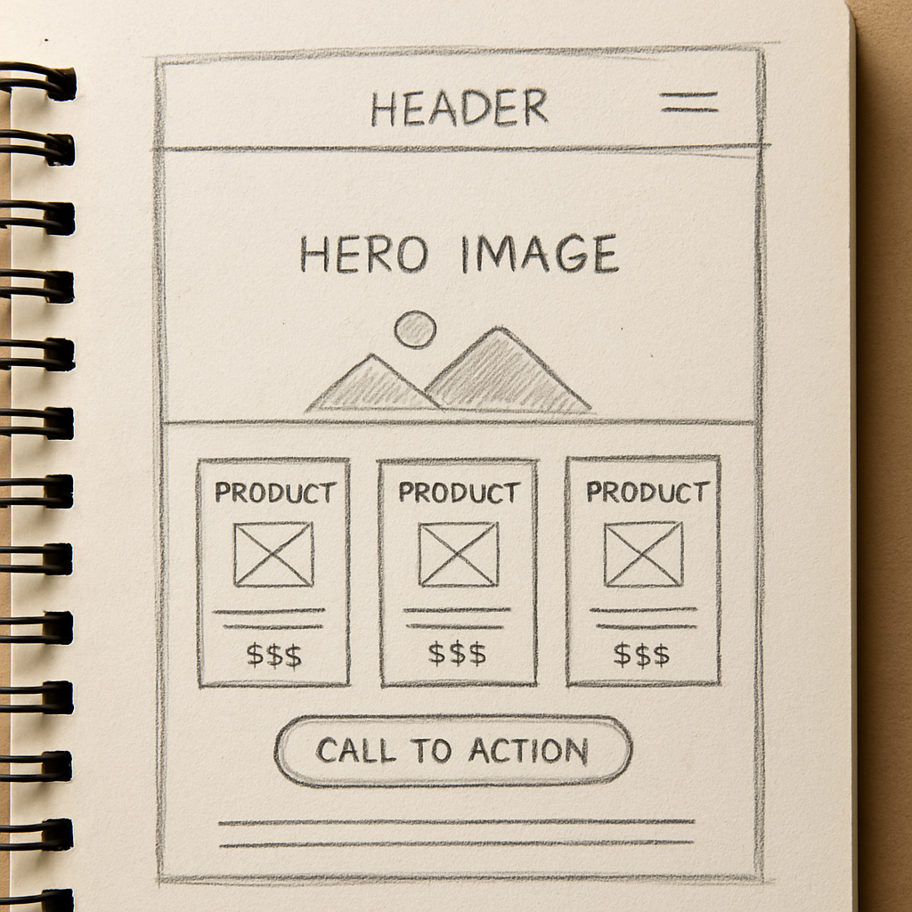
Sketch a quick flowchart on paper – arrows, sticky notes, whatever works. This visual will guide the layout, navigation, and call‑to‑action placement later on.
And here’s a tiny secret we’ve seen work wonders for Aussie small businesses: keep the journey as short as possible. If a checkout form has five fields, trim it down to three. If a “Contact Us” page asks for a mailing address when you only need an email, drop it. Every extra click is a chance of abandonment.
Now match your brand personality to each goal. A playful bakery might use bright, hand‑drawn icons and a friendly “Grab a slice!” button, while a professional services firm would opt for clean lines and a confident “Get a free quote” prompt.
Gather the assets you’ll need – high‑resolution photos of your product, a short tagline that sums up your promise, and any brand guidelines you already have. If you don’t have professional images yet, consider using a local photographer or even a smartphone – authenticity beats polished stock every time.
Finally, write a one‑sentence mission statement that ties brand and goal together. Something like, “We help busy mums find healthy snacks fast, so they can spend more time with their kids.” This sentence becomes the North Star for your design decisions.
With your brand personality nailed down, clear goals set, and a visitor journey mapped, you’ve built the foundation any good website design for small business needs. The next step will be turning this blueprint into a simple wireframe that visualises where each piece lives on the page.
Ready to sketch? Grab a pen – the fun part is just beginning.
You’ve nailed your brand and goals, now you need a place to build that vision. In Australia the most common choices are DIY site‑builders, WordPress‑based solutions, and purpose‑built ecommerce platforms. Each one feels like a different kitchen – some come pre‑fitted with appliances, others give you a blank countertop to customise.
DIY builders (think Wix or Squarespace) are quick, but they lock you into a closed ecosystem – great for a one‑off brochure site, not ideal if you plan to grow your product range or need deep integrations.
WordPress gives you freedom, thousands of plugins, and a massive community of Aussie developers. The trade‑off is a steeper learning curve and the responsibility to keep everything secure.
Specialised ecommerce platforms (like Shopify) streamline checkout and inventory, yet they charge transaction fees and can feel heavyweight for a local boutique that only sells a few dozen items a month.
Whatever platform you pick, the host underneath is the foundation. A reliable host means your site stays up when a customer in Sydney clicks ‘Buy now’ at 9 pm. The PCMag guide to small‑business web hosting highlights a few non‑negotiables for us down under.
Managed hosting is worth a look if you’d rather focus on your coffee shop menu than server patches. With managed plans the host acts as your IT squad – handling backups, security updates and performance tweaks.
Grab a notebook and run through this quick list. Tick each box before you sign the contract.
Once you’ve answered “yes” to most of these, you’ll have a platform‑hosting combo that matches your brand ambition and your budget. Remember, the goal isn’t just to launch a pretty site – it’s to give your customers a seamless, secure experience that keeps them coming back.
And if you ever feel stuck, Free Website Chick can help you pick a platform that fits your workflow and set up a managed hosting environment so you can focus on the things you love – whether that’s baking, crafting, or closing sales.
Alright, you’ve nailed your brand and you’ve picked a platform. Now the real fun begins – figuring out how people will actually move around your site. If you’ve ever felt lost in a grocery store because the aisles were confusing, you know exactly what a bad navigation feels like. That friction turns curious visitors into lost sales.
What we’ve seen work best for Aussie small businesses is to start with three core questions: where does the user want to go, what information do they need to get there, and how quickly can they do it? Answer those and you’ll have a layout that feels as natural as a chat over a flat white.
These platforms give you drag‑and‑drop blocks that snap together like Lego. The upside is speed – you can have a homepage live in an afternoon. The downside? You’re limited to the navigation structures the builder offers, which often means a single‑level menu and a handful of footer links.
Real‑world example: Sarah, who runs a boutique floral shop in Byron Bay, used a DIY builder to get online fast. Her site looked gorgeous, but customers kept asking where the “wedding bouquets” page was because the menu only showed “Shop” and “Contact”. She ended up adding a hidden sub‑page, which confused Google and hurt her SEO.
WordPress opens the door to mega‑menus, breadcrumb trails, and custom post‑type archives. You can build a mega‑menu that groups products, services, and blog posts in logical sections. It does require a bit more technical know‑how, but the flexibility usually pays off for growing businesses.
Take Tom, a wholesale furniture supplier in Melbourne. He used a WordPress theme that let him create a three‑tier navigation: Products → Office → Desks → Ergonomic. Customers could drill straight to the exact desk they needed, and his conversion rate jumped 22% after the change.
If you’ve outgrown the constraints of themes, a custom build (or a headless CMS feeding a static‑site generator) gives you total control. You can design progressive navigation patterns like “sticky sidebars” that stay visible as users scroll, or “guided checkout flows” that only show the next step when the previous one is completed.
Julie, who operates a niche pet‑supplies store, invested in a custom React front‑end that displayed a “quick‑add” button right on the product grid. Shoppers could add items without ever leaving the page, and average order value rose by 15%.
| Option | Pros | Cons | Best for |
|---|---|---|---|
| DIY builder | Fast launch, no code needed | Limited menu depth, SEO constraints | One‑off brochure sites, low‑budget starters |
| WordPress + plugins | Flexible menus, huge ecosystem | Requires some maintenance, potential plugin conflicts | Growing retailers, content‑heavy sites |
| Custom / headless | Full control, cutting‑edge UX patterns | Higher cost, need developer expertise | Established brands, complex product catalogs |
Now, how do you decide which path to take? Here’s a short checklist you can run through while sipping your coffee:
While you’re mapping out the navigation, remember that visual hierarchy matters just as much as the menu itself. Use colour‑coded sections, consistent iconography, and plenty of white space to guide the eye. The sitecentre checklist notes that good visual hierarchy boosts perceived credibility by up to 75%.
Don’t forget the human element – high‑quality images make a site feel trustworthy. If you need professional headshots or product photography, consider a partner that specialises in corporate imagery; high‑quality professional headshots can instantly lift the perceived value of your brand.
Finally, keep testing. Use tools like Google’s Core Web Vitals to see if your menu is slowing down page load, and run simple “click‑through” tests with friends or staff. Small tweaks – moving a menu item one spot, changing a label from “Our Services” to “What We Do” – can lift conversion rates dramatically.
When you feel the navigation is solid, you’ll notice visitors gliding through the site rather than stumbling. That’s the sweet spot where design, layout, and UX finally start working together to turn browsers into loyal customers.
Need a deeper dive into managing all these moving parts? Check out our guide on Effective website management for small business – it walks you through audits, updates, and keeping your site humming long after launch.
Alright, you’ve got the design, navigation and the tech humming – now it’s time to make sure the right people actually find you when they type “website design for small business” into Google.
Think about the last time you searched for a local plumber in Brisbane. You probably didn’t scroll past the first few results, right? That’s the power of localisation – the same principle works for your boutique, your wholesale store or your service business.
Start by writing as if you’re chatting over a flat white with a neighbour in your suburb. Use the terms they’d use: “Sydney CBD”, “Gold Coast”, “regional NSW”. Sprinkle in state abbreviations (NSW, VIC, QLD) where it feels natural. Search engines love that geo‑specific language and it tells Aussie users you speak their dialect.
Tip: Create a short “local voice” cheat sheet. List the city, suburb and any local landmarks you can weave into headings or body copy. A coffee roaster in Fitzroy might mention “near the Rose Street Artists’ Market” – that tiny detail can push you up in local SERPs.
We all know the classic advice – pepper your primary keyword “website design for small business” throughout the copy. But if you force it into every sentence, you’ll lose that human vibe we’re after.
Instead, aim for a natural density: include the phrase in the H2 (already done), once in an H3, and sprinkle related long‑tail variants like “affordable website design for Aussie retailers” or “custom website design for Melbourne startups”. Use them in bullet points, image alt text and meta descriptions.
Meta titles should be under 60 characters and include your primary keyword near the front. Something like “Website design for small business – Free Website Chick (AU)”. The description, 150‑160 characters, needs a hook and a local cue: “Get a free, Aussie‑focused website design that drives sales in Sydney, Melbourne and beyond. Let’s build your online shop today.”
Remember, the description is your elevator pitch in the search results. Write it like you’d speak to a potential customer on the phone – clear, friendly, and with a call‑to‑action.
If you haven’t dabbled with schema before, think of it as giving Google a cheat sheet about your business. Adding “LocalBusiness” schema with fields for address, phone, opening hours and a map pin tells Google you’re a real, physical Aussie business.
Most website platforms let you drop a small JSON‑LD snippet into the header. It looks technical, but you can copy a template and just swap out your own details. When Google sees the schema, it can show your business in the “Local Pack” – those three highlighted results right at the top of a local search.
Browse the “People also ask” box for queries like “how much does website design cost in Australia?” or “best website builder for small business Melbourne”. Craft blog posts or FAQ entries that answer those questions directly. Use a conversational tone – start with “If you’re wondering…” and end with a clear next step.
For example, a quick post titled “How much does a custom website design cost for a small Sydney shop?” can rank for both the keyword and the location, pulling in highly intent traffic.
Backlinks are still a ranking factor, but quality beats quantity. Reach out to local business chambers, industry blogs or community newsletters and offer a guest article about “Why every small Aussie retailer needs a mobile‑first website”. When they link back to your site, you get a trusted Aussie endorsement.
Even a simple citation on a local directory (e.g., Yellow Pages Australia) adds a signal that you’re a legitimate local business.
Australian users expect a page to load in under two seconds, even on 4G. Use tools like Google PageSpeed Insights to spot heavy images or render‑blocking scripts. Compress product photos, serve them via a CDN with an Australian edge node, and lazy‑load images that sit below the fold.
Mobile‑first design isn’t optional – most of your traffic will come from phones on the tram or in a cafe. Test your site on a range of devices and make sure tap targets are at least 48 px tall, as Google recommends.
Finally, set up Google Search Console and monitor the “Performance” report. Look for impressions and clicks from specific cities. If you notice a drop in, say, Perth, revisit the content and add a Perth‑specific case study.

Take these steps one at a time, and you’ll start seeing your site appear in front of the right Aussies – the ones ready to become your next customers.
Alright, you’ve built a site that looks and feels right – now it’s time to make sure it actually works and stays safe. Ever launched a website only to discover a broken checkout or a missing privacy notice the next morning? That panic is avoidable with a solid test‑and‑maintain routine.
First thing’s first: run through every user journey as if you were a brand‑new visitor. Open the homepage on a phone, a tablet and a laptop. Click the “Buy now” button, fill out the contact form, and watch the thank‑you page pop up. If anything feels slow or confusing, note it and fix it now.
Here’s a quick checklist you can copy‑paste into a Google Sheet:
Does your checkout still redirect to a non‑secure HTTP page? If so, that’s a red flag – browsers will block it and customers will bail.
When you’re ready to flip the switch, run this short but mighty list:
Tip: If you’re not sure how to interpret the scan results, the Digital Solutions program offers low‑cost, one‑on‑one advice for small Australian businesses.
Launching is only the beginning. Think of your website like a shop front – you’d dust the windows, restock the shelves and check the lock on the door every week. The same applies online.
Schedule a monthly “site health” day. Open your Google Search Console, look for crawl errors, and fix broken links. Update plugins or platform patches within 48 hours of release – the longer you wait, the more you invite hackers.
Backups aren’t just “nice to have”. Test a restore at least once a quarter; a backup you never open is as good as none. Keep an off‑site copy (e.g., an Australian‑based cloud bucket) separate from your host.
Security isn’t only about code. Review the data you collect. If you store customer emails, phone numbers or payment details, double‑check that you’re only keeping what you really need. The OAIC guidance reminds us that many small businesses don’t even fall under the Privacy Act, but opting in can boost customer trust.
Finally, keep an eye on performance. A site that slows down after a new product launch can scare shoppers away. Use a simple cron job or a managed‑hosting alert to notify you when page speed drops below your 2‑second target.
By testing rigorously, launching with a security checklist, and treating maintenance as a regular habit, you’ll protect your customers, your reputation, and your bottom line. And when the next wave of orders rolls in, you’ll be ready to catch them without a glitch.
We’ve walked through everything from branding to security, so you can see why a solid website design for small business feels like a reliable teammate.
Think about the last time a customer breezed through your site, added a product, and left a happy review. That smooth experience didn’t happen by accident – it’s the result of clear goals, a clean layout, and ongoing care.
So, what’s the next step? Grab a notebook, list the three biggest pain points you still see, and match each to one of the checklists we covered – brand brief, platform choice, navigation depth, local SEO, or a launch test.
Set a simple deadline: give yourself two weeks to tidy up any loose ends, then schedule a monthly “site health” day. During that hour you’ll run a quick speed check, glance at Google Search Console for crawl errors, and verify backups are fresh.
Remember, you don’t have to perfect everything before you go live. Launch, learn, and iterate. Each tweak you make brings your visitors a step closer to becoming loyal customers.
Ready to put your new website design for small business into action? Let’s get your shop humming and watch the orders roll in.
Start today and watch the difference.
Start with a crystal‑clear brand brief. Jot down your core values, the colours you love, and the tone you want to speak in – think of it as a cheat‑sheet for every page. Then map the three main actions you want visitors to take, whether it’s booking an appointment, buying a product, or signing up for a newsletter. With those basics nailed, the rest of the website design for small business falls into place.
Pricing can feel like a mystery, but most Aussie small owners spend between $1,500 and $5,000 for a professionally built site that includes design, hosting and a few months of support. If you’re on a tighter budget, a DIY builder might start at $20 a month, yet you’ll likely trade off custom branding and SEO flexibility. In our experience, investing a few thousand now saves you time and lost sales later.
A custom domain is more than just a web address – it tells customers you’re serious and makes it easier for search engines to trust you. SSL encrypts any data your visitors send, so the little padlock in the browser isn’t just for show; it protects payment details and boosts SEO rankings. Both are standard on any decent hosting plan, and the cost is usually included or a few dollars a year.
A cluttered menu is the silent sales killer. Most small sites shove five or more top‑level links, then hide important pages in footers, which forces users to hunt. The fix? Keep the main navigation to three‑four items and use clear, action‑oriented labels like “Shop Now” or “Book a Call”. If you need deeper structure, add a simple dropdown or a “Resources” hub, but always test that the path to purchase is no more than two clicks.
Speed matters more than you think, especially on 4G or rural connections. Start by compressing every image – aim for under 100 KB for product shots and use modern formats like WebP. Enable browser caching so repeat visitors don’t reload the same files, and serve your files from a host with an Australian edge server. Finally, run a quick test in Google PageSpeed Insights and fix any “eliminate render‑blocking resources” warnings.
Content fatigue is real, but you don’t need a full‑time writer. Set up a simple “content calendar” with one new blog post or product update each week – even a short 300‑word tip can boost SEO. Repurpose existing assets: turn a customer testimonial into a social graphic, or slice a longer case study into bite‑size FAQs. Use a free tool like Google Docs to draft, then schedule publishing directly from your CMS.
Treat your site like a regular health check‑up. Once a month, glance at Google Search Console for crawl errors, broken links and any sudden traffic drops. Run a quick speed test and verify your SSL certificate is still valid. If you’ve added new products or pages, double‑check that meta titles and descriptions include the keyword “website design for small business” where appropriate. A 15‑minute audit each month keeps problems from snowballing.